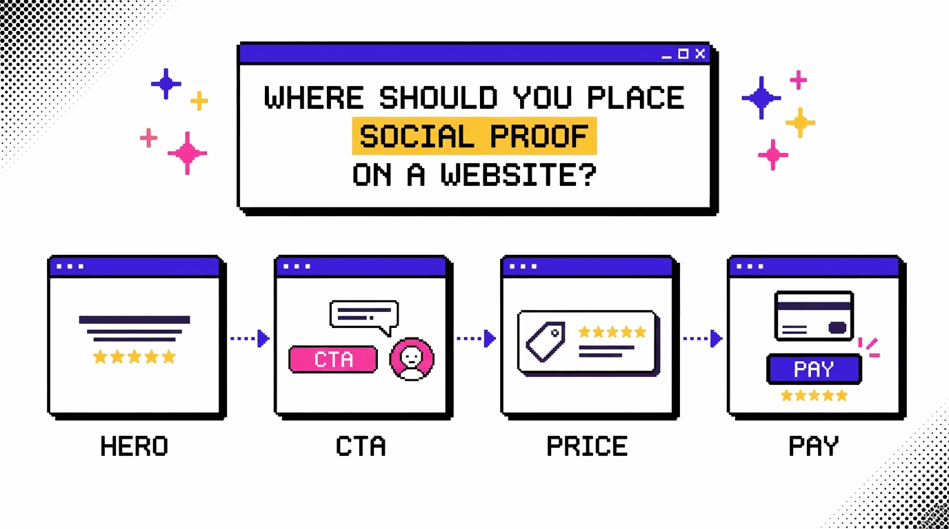
Reading time approx. 10 min | Updated on 17 November 2026 | First published on 17 November 2026
A study by Northwestern University’s Spiegel Research Center found that products with five reviews are 270% more likely to be purchased than products with no reviews. The researchers arrived at this figure after examining data from more than 100,000 products.
That finding says a lot about how customer feedback can influence buying decisions. And since many websites already collect testimonials, reviews, client logos and other forms of social proof, there’s a good chance you have some of these assets on your own site.
What matters is where visitors encounter them. Underwater Audio, for example, moved a customer testimonial to a position where visitors could read it before reaching the call to action. That single change increased sales by 35.6%. The testimonial itself remained unchanged throughout the experiment.
This is why placement deserves attention when you’re working on website conversions. A customer review might carry more weight when someone is considering a purchase, while a client logo could help establish credibility much earlier in their visit.
In this article, we’ll look at five places where social proof can support a visitor’s decision, with examples from brands that have seen measurable conversion improvements. We’ll also cover how to test different positions on your own website using CROLabs, along with a few placement mistakes worth avoiding.
What Counts as Social Proof (and Why Position Changes Its Job)
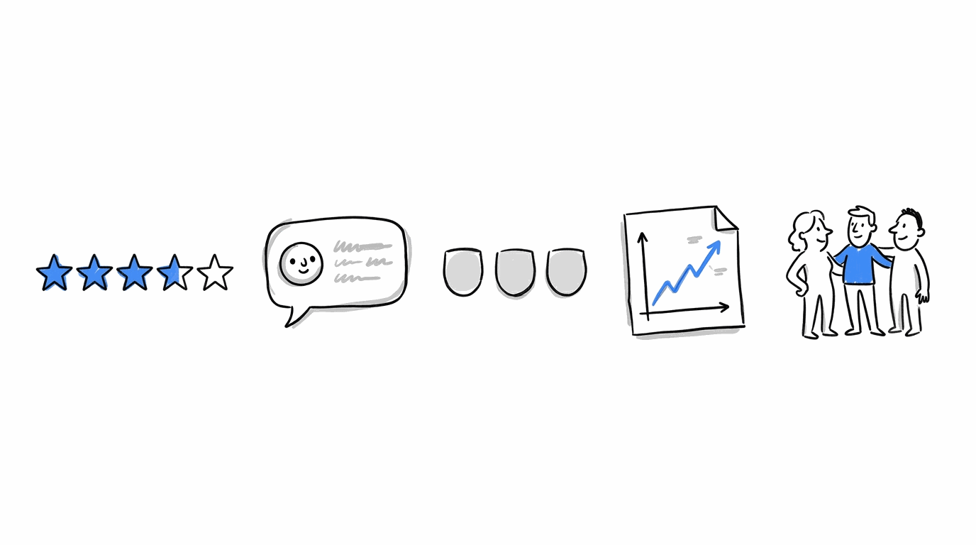
Social proof is any evidence that other people already trust what you sell. The common types are:
- Reviews and star ratings, including the ones pulled in from sites like Trustpilot or G2
- Testimonials, written or on video
- Customer logos
- Case studies with real numbers in them
- Usage counts, such as “2,000 teams use this”
Different forms of social proof help visitors make different decisions. Seeing familiar company logos, for instance, can give someone an idea of the businesses already using a product. A case study goes further by showing what a customer achieved with it, which becomes especially useful when a visitor starts looking at pricing or deciding whether the product is worth the cost.
These questions tend to come up at different stages of a visitor’s journey through your website. So, the type of proof you show and where you put it can influence how useful it is to someone making a decision.
Where Should Social Proof Be Placed on Your Website?
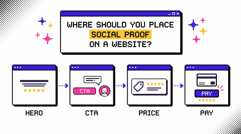
a. Above the Fold: Put One Strong Proof Where the Page Starts
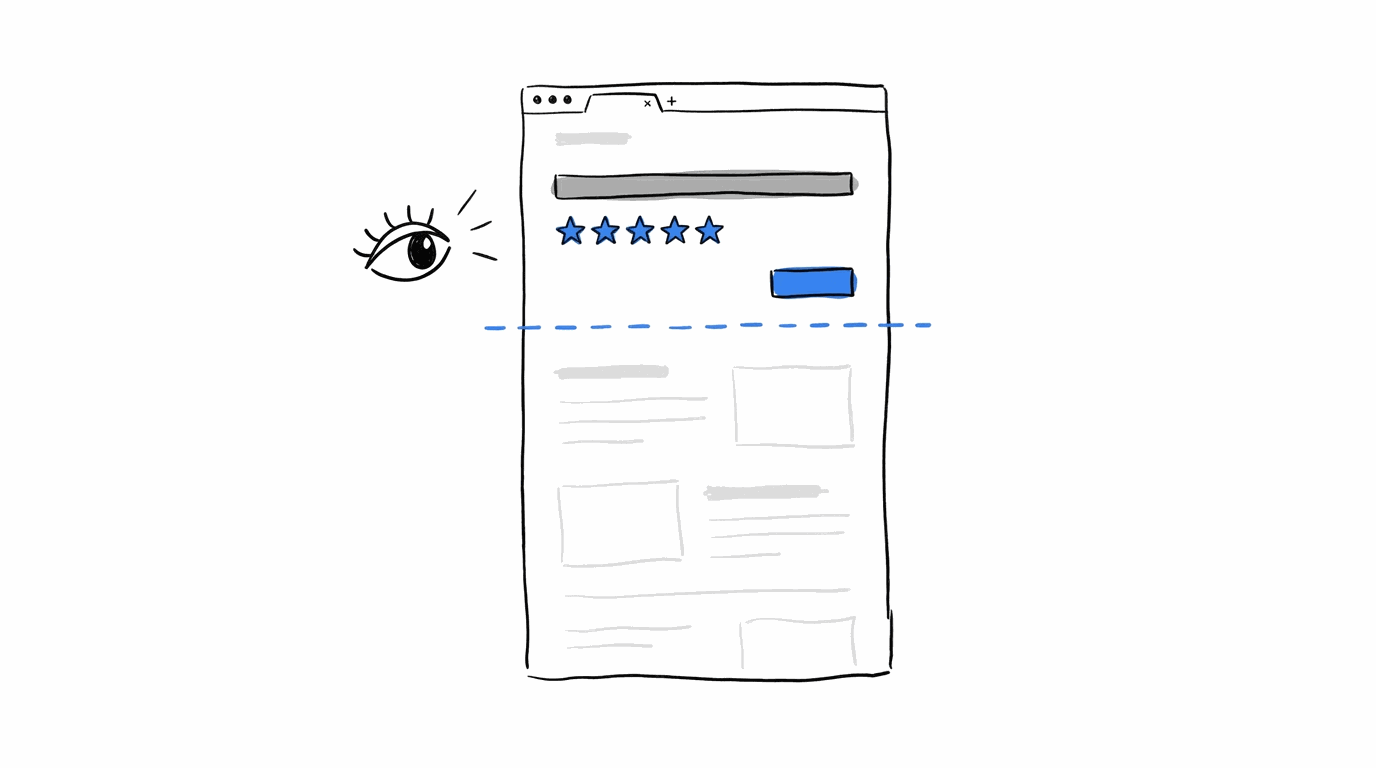
The area visitors see as soon as your page loads is a good place to start when deciding where to put social proof. Your headline introduces what the business offers, and a customer testimonial placed nearby can help visitors feel more confident about the claims they’re reading, even before they scroll down.
There’s some evidence to support this. In a test documented by VWO, Michael Aagaard placed two customer testimonials above the fold on his ebook landing page, and conversions increased by 64.53%. LKR Social Media also experimented with customer feedback on its homepage, using a testimonial as the main headline. Newsletter signups went up by 24.31% as a result (same source).
What fits up there depends on the page:
- Product pages: a star rating with the review count under the product title
- SaaS homepages: a row of customer logos under the headline
- Landing pages: one testimonial that echoes the headline’s promise
One or two items is enough, since the headline still needs room to work.
Pro-Tip: If you suspect the top of your page is losing people, heatmaps will show it. Analytics & Heatmaps in CROLabs show how far visitors scroll and where they leave, and you can also diagnose your low-converting landing pages with it.
Find out what's happening above the fold
Are visitors scrolling past your headline without engaging? Use CROLabs' heatmaps and analytics to see how people interact with your page, where they stop scrolling and which sections might need attention.
b. Beside the CTA Button and Your Forms
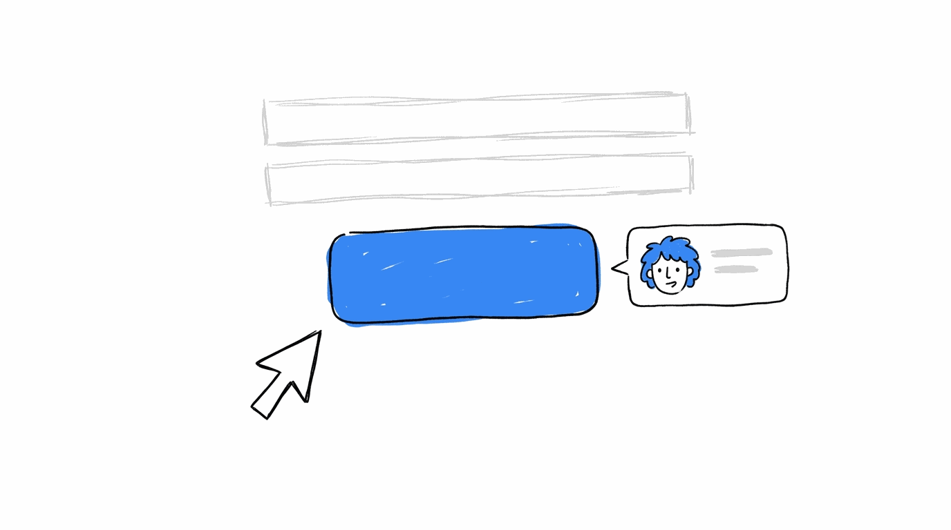
Visitors usually make their final decision around the point where they encounter a call to action. Placing a testimonial or customer review close to that button gives them something reassuring to consider before they click.
Underwater Audio tested this by moving a customer testimonial to a position where visitors would see it before reaching the call to action, following the F-shaped reading pattern. The change increased sales by 35.6%.
You can apply the same approach to your forms. When someone is about to share their email address or other details, a short testimonial nearby can help them feel more comfortable completing the process.
A few things work well in that spot:
- A one-line quote with a name and a photo, sitting right next to the button
- A short logo row above or beside the form fields
- A rating summary directly under the submit button
Keep these short. The button still has to be the loudest thing around it.
You don’t need a developer to try this. With the Visual Editor, you can drop a testimonial block beside a button, and A/B testing then splits your traffic between the old and new versions so you see which one converts better.
c. On Product and Pricing Pages, Next to the Price
When visitors reach your pricing section, they’re thinking about what they’ll get for their money and whether the cost makes sense. Customer reviews placed close to the price can help them feel more comfortable making that decision.
Hammacher Schlemmer, an online retailer known for its higher-priced gifts, was included in research by Spiegel’s Research Center. The findings showed that displaying customer reviews could increase a product’s conversion rate by as much as 270%. The first five reviews had the greatest effect, particularly for more expensive products.
Third-party reviews can also help when someone is considering a purchase. In one case study, an ecommerce website added a Trustpilot widget to its pages and recorded a 58.29% increase in sales.
Here’s where to put proof on these pages:
- A star rating and review count next to the price or the “Add to cart” button
- A one-line outcome quote, with a number if you have one, under each pricing plan
- A customer logo from a recognizable company near your highest-priced plan
You should also look at what happens right after a visitor clicks your button.
Test a different placement for your testimonials
Move customer reviews closer to your CTA, try a different layout and see how visitors respond. CROLabs lets you make these changes with its Visual Editor and compare both versions through A/B testing.
d. At Checkout, Under the Pay Button
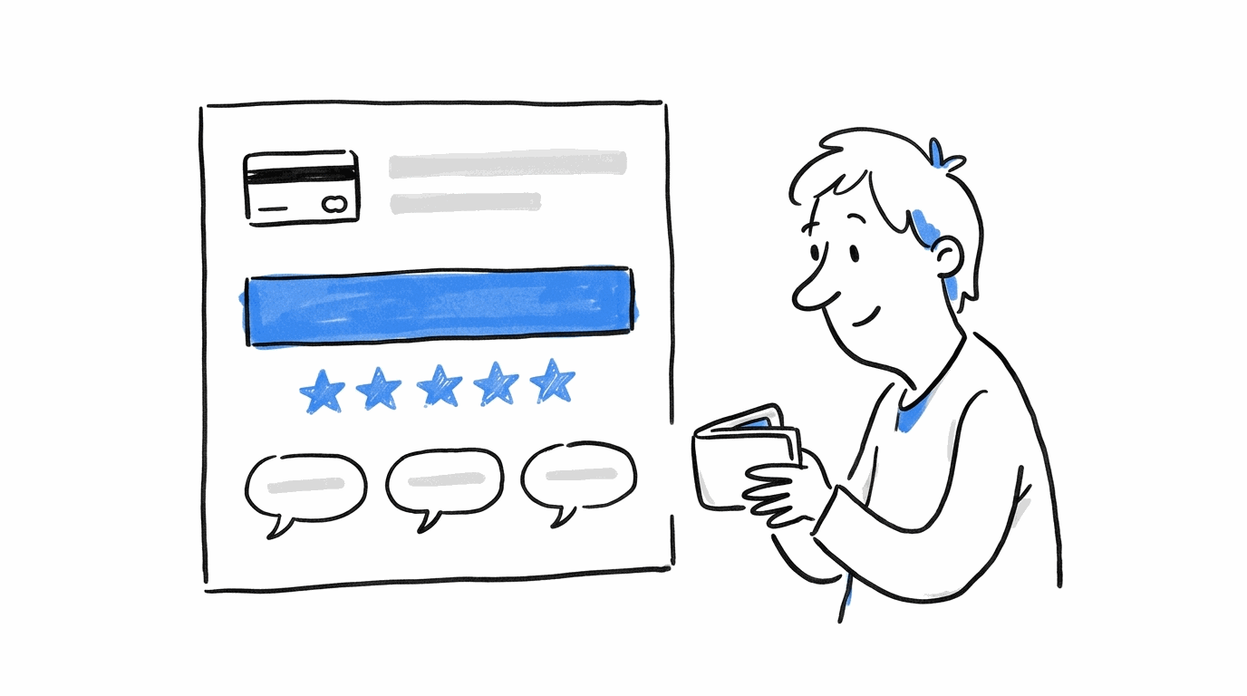
Doubt peaks at checkout because money is about to change hands. A gin subscription brand tested this by adding “Rated 4.9 stars from over 6,000 reviews” and three customer reviews directly under its “Pay now” button. That one change brought in an extra A$6,145 in monthly revenue (Convertibles case study).
The agency that ran the test points out that each review answered a separate concern. One covered product quality, another covered the experience of getting a box, and the third covered delivery and value. They also placed the reviews below the button, so people who were hesitating found them while those who were ready could still click.
If you’re also working on abandoned carts, our guide to reducing cart abandonment pairs well with this placement.
e. Follow the Doubt, Not the Template
Every spot above worked because it sat where visitors had a question. So the most reliable way to place proof on your own site is to find the questions first and then match them to the right evidence.
| What the visitor is wondering | Proof that answers it | Where to put it |
|---|---|---|
| Is this any good? | Star rating and review count | Beside the headline or product title |
| Does it work for a business like mine? | Industry-matched case study or logos | Beside features or pricing plans |
| Is it worth the money? | Testimonial with a result and a number | Under the price |
| Can I trust them with my card? | Rating plus a few short reviews | Under the pay button |
You can work through your own pages in this order:
- Find the drop-off points. Heatmaps and analytics show where visitors stop scrolling or leave.
- Name the doubt at each one. Use the table above as a starting point.
- Add the matching proof. The Visual Editor lets you build the variation without code.
- Test it. Run an A/B test, and track results with conversion tracking so you know which version brought in more signups or sales.
- Keep the winner and move to the next spot. Gains stack up over time, which is why a CRO roadmap helps you plan the order.
If you don’t know where to begin, the CRO Advisor crawls your site and gives you a prioritized list of what to fix first. For sites that get different kinds of visitors, Audience Personalization lets you show a SaaS buyer one set of logos and an agency buyer another.
Spots Where Social Proof Works Against You
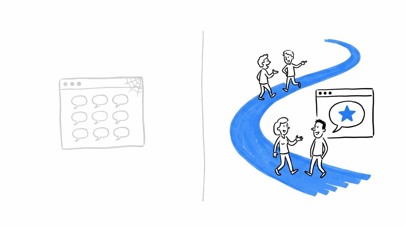
A few placements cost you conversions, and they’re worth knowing about before you start moving things around.
- A separate testimonials page. VWO notes that on a page like this only one or two testimonials get read, so it recommends spreading them across the pages in your conversion funnel instead (source).
- Ratings that look too perfect. Spiegel’s research found that products rated between 4.2 and 4.7 were bought more often than those rated 4.7 to 5.0, because shoppers tend to doubt reviews that are all praise (source). Showing a few mixed reviews makes the rest more believable.
- A crowded checkout. The Convertibles team found three reviews helped, and they advise adding trust elements one at a time, since too many create noise (source).
When you test any of these, give each test enough traffic before you pick a winner. Our article on how to avoid false positives in A/B tests shows how to do that.
Conclusion
Social proof earns its place when it sits next to the moment a visitor hesitates. That could be the headline at the top of a landing page, the button below a form, the price on a product page or the pay button at checkout. The brands covered here each found a spot like that and saw their numbers move.
Your own pages will have different hesitation points, so the quickest way to find them is to look at where visitors drop off and test one placement at a time. CROLabs puts the analytics, the editor and the testing in one place, and you can start with a 14-day free trial.
Ready to find the best social proof placements for your website?
CROLabs brings heatmaps, website editing, A/B testing and conversion tracking together, so you can study visitor behaviour, try different layouts and see which changes bring more conversions. Start with a 14-day free trial and see what works on your website.
FAQs

Keep learning on the CROLabs blog
Practical guides on A/B testing, personalization and landing page optimization. New articles every week.
Ready for measurable optimization?
Show us one landing page. In 30 minutes we walk you through what CROLabs would test first and what it could mean for your conversion rate.