Updated Sep 2026
Have you ever had your ad campaign hit every number you’re tracking (we’re talking click-through rate climbs, cost per click drops, and the dashboard looks better every week you check it), only for that traffic to land on your site and almost none of it converts?
Teams can spend weeks refining audiences and ad creative while the landing page receiving all that traffic sits untouched for months. If the experience after the click creates friction, better ads will only send more people into the same problem.
In this guide, we’ll look at what the post-click experience involves, why it matters for paid traffic, and eight practical ways to improve what happens between the click and the conversion.
On This Page
What Is Post-click Experience?
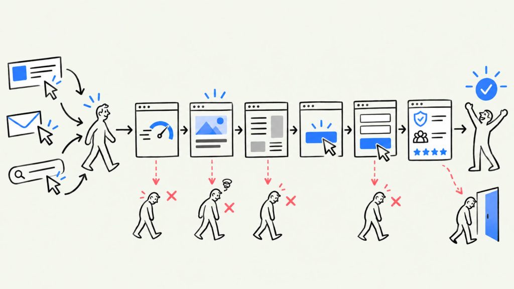
The post-click experience starts the moment someone clicks your ad, email link, or search result. From there, it covers everything they encounter before they either convert or leave. That might mean how quickly the landing page loads, what the headline says, how the page is laid out, how the form works, and what the visitor sees after submitting it.
The definition of post-click experience is pretty straightforward across the industry. You’re looking at the entire journey between the click and the action you want the visitor to take, whether that’s buying something, signing up, downloading a resource, or completing another goal on the page.
Getting someone to click is one part of the job. Once they arrive, the page has a different set of things to get right. The copy, design, usability, and technical setup all affect what happens next.
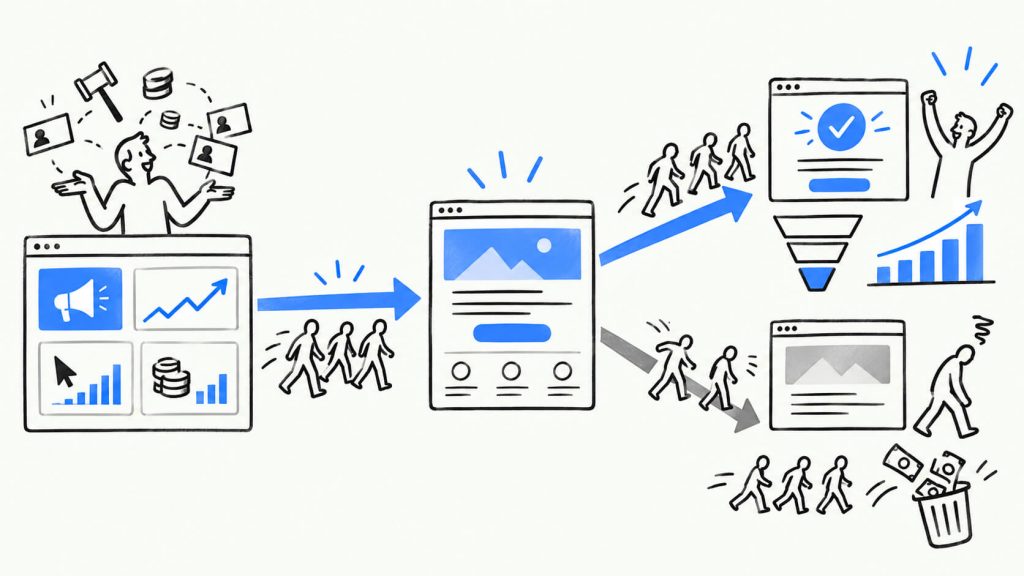
But most of the attention tends to stay on the ad. Marketers spend time testing the message, refining the audience, and watching the numbers because that’s where the money is going. The landing page often gets a different treatment. It gets built, published, and left alone. Someone usually takes another look only after the conversion rate starts falling and the problem has become hard to ignore.
Why This Matters For Anyone Running Paid Traffic
When you’re paying for traffic through Google Ads, Meta, or another ad platform, the post-click experience is one of the few parts of the journey that sits almost entirely in your hands.
Say your CPC suddenly goes up because the auction gets more competitive. There’s only so much you can do about that. However, your landing page is a different story. You decide how quickly it loads, whether it delivers on what the ad promised, and how easy it is for someone to figure out what to do next. If you’re using CROLabs or a similar tool, you can also keep an eye on what visitors do once they get there.
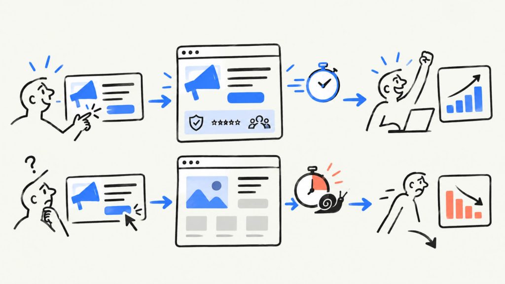
Page speed gives you a good example of why this matters. Portent looked at more than 27,000 landing pages and found that conversion rates hit an important threshold around four seconds. Their data also showed conversions falling by 7% for every extra second of delay after 2.5 seconds.
So someone can click an ad that works perfectly well and still leave because the page takes too long to load. The problem sits on your site, which means you have a direct way to work on it.
If you sell software, run an ecommerce business, or manage paid campaigns for clients, this is a good place to start looking for wasted spend. Here are eight areas you can start checking.
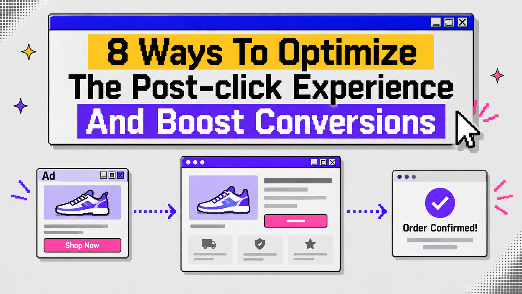
8 Ways To Optimize The Post-click Experience And Boost Conversions
1. Match Your Landing Page To What The Ad Promised
This sounds like an easy thing to get right, yet it gets overlooked all the time. Imagine your ad says “Start your free trial today” but the landing page asks visitors to “Book a demo”. The visitor clicked because they wanted to try the product, instead they’re being asked to get on a sales call. That disconnect happens before they’ve even had a chance to consider the offer.
This is what marketers mean by message match. It’s one of the easier CRO factors to test because you can trace the connection between the message that earns the click and the experience that follows it.
In one test, simply bringing the ad and landing page messaging into alignment increased conversions by 66%. The offer stayed the same and so did the audience, budget, and creative. The change came down to the landing page headline echoing the message that had already convinced someone to click.
Here are a few simple ways to check your message match:
- Put your best-performing ad beside the landing page it sends people to, then compare the wording. If the headline feels disconnected from the ad, start there.
- Use the same CTA language in both places. If the ad says “Start free trial”, the page should carry that same idea instead of switching to something vague like “Get started”.
- Match landing pages to the reason someone clicked. If your ads speak to different pain points, give each angle its own page or personalize the same page around the visitor’s intent.
- Keep paid social traffic tied to the offer in the ad. Sending someone from a specific promotion to a general homepage creates a mismatch as soon as they arrive.
2. Fix Your Page Speed Before You Touch Anything Else
Speed probably isn’t the most interesting thing to work on when you’re trying to improve a landing page, but the numbers around it are hard to ignore. One widely cited study found that a page taking five seconds to load was almost twice as likely to lose the visitor to a bounce as one that loaded in a single second.
Unbounce’s benchmark data shows a similar pattern with forms: pages with three fields convert at 10.1%, compared with 3.6% for forms with nine fields. We’ll come back to forms later. Speed deserves attention first because a slow page can stop someone before they ever see the headline, form, or trust signals you spent time improving.
So run a speed test on the page before you start rewriting the copy. Large or poorly optimized images are common culprits. Autoplay video can add another layer of delay, and third-party scripts such as chat widgets, tracking pixels, and review carousels can compete with the page content for resources while everything is loading.
You can often fix these issues without getting a developer involved. Many CMS platforms handle image compression for you, and non-essential scripts can usually be pushed further down the loading sequence so the main content appears first. When developer help is needed, these are often straightforward changes rather than a major rebuild.
3. Give Visitors One Obvious Action
A landing page can get crowded pretty quickly. Add a navigation bar, a few different CTAs, a chat widget, and a newsletter popup, and visitors suddenly have a lot to process before they’ve even decided whether they want what you’re offering. Every additional option creates another opportunity to click away from the action you want them to take.
So give the page one clear primary CTA and make that the obvious next step. You can still include useful links to things like pricing, FAQs, or testimonials for people who need more information, just keep those secondary options from competing with the main action. If someone scrolls through the page before making up their mind, repeat the primary CTA further down so they don’t have to go looking for it.
Getting The Click Is Only Half The Job
Use CROLabs to understand what visitors do once they land on your site and personalize their experience around the traffic that brought them there.
Cancel anytime.
4. Cut Your Form Down To What You Actually Need
We’re back to the forms, and one thing you should keep in mind is that every field you add to a form gives the visitor another reason to hesitate. Yet it’s common to see forms asking for information a business won’t need until much later, like job title, company size, phone number, or annual revenue.
Someone might be filling out the form because they’re interested in the product, and suddenly they’re being asked to hand over half their business profile before they’ve even seen what happens next.
Just relax your mind with the fact that starting a form is already a meaningful signal. The visitor has made it far enough down the page to consider taking action, so it’s worth being careful about what you ask for at that point. Asking for detailed qualification information too early can turn that interest into an abandoned form.
If your sales team needs more information to qualify leads, collect the essentials first. You can ask for the rest after the person signs up or books a call, when there’s already more context and commitment. Keep the first step easy, then gather additional details later when you have a reason to ask for them.
5. Put Trust Signals Where The Decision Happens
A testimonial that is buried on an About Us page won’t do much for a visitor who never sees it. Trust signals work best when they appear close to the point where someone has to make a decision, such as beside the CTA or next to the form.
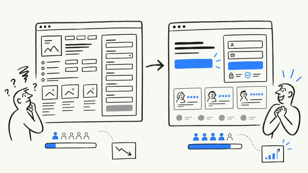
A few types are especially useful:
- Specific testimonials: “Great product!” tells a visitor very little. Give them a name, a company, and some detail about what the customer achieved.
- Recognizable customer logos: If you work with companies your audience knows, showing those logos can give the page an immediate credibility boost.
- Security and privacy signals: Put these close to forms that ask for payment details or other personal information. That’s where people are most likely to have concerns about handing over their information.
- Numbers people can verify: “Trusted by thousands” sounds vague when there’s nothing behind it. A specific figure with a clear source gives visitors something concrete to assess.
6. Make The Offer Clear Without Scrolling
Whatever your ad promised needs to show up clearly in the first section someone sees, before any scrolling. A headline like “Transforming the way you work” could describe almost any company on the internet, and vague language like that does nothing for a visitor deciding whether to keep reading.
Give them something they can understand straight away. Something specific like a stated number, a named outcome, a concrete benefit, gives them a reason to stay.
People make quick judgments about whether a page deserves their attention. If the headline leaves them trying to work out what you offer, you’re making that decision harder than it needs to be.
7. Personalize The Page To The Traffic Source
People arrive on your site with different reasons for being there, so giving everyone the exact same experience can cost you conversions. Someone searching Google for “CRO software for agencies” has a different reason for clicking than someone who comes back through a retargeting ad after visiting your pricing page before.
Tools built for this, CROLabs’ ad-to-page personalization among them, let you dynamically swap headlines, images, or offers based on the campaign, keyword, or audience segment that sent someone to your page. The headline might speak directly to their search, or the image and offer might change to fit the campaign. You can build an experience around several ad angles without having to maintain a separate landing page for each one.
The difference becomes more noticeable as the number of campaigns grows. One general landing page might work when you’re running a small set of ads but once you’re targeting several audiences with different needs, that same page has to serve too many people at once. Because of this, visitors can end up on a page that never speaks to the reason they clicked in the first place.
8. Treat The Thank-You Page As Part Of The Funnel
The confirmation page is easy to forget once the main conversion has happened. Someone has just handed over their email address, payment details, or time, which means they’ve already shown a level of interest. Sending them to a page that says “Thanks, we’ll be in touch” leaves that moment with very little to do.
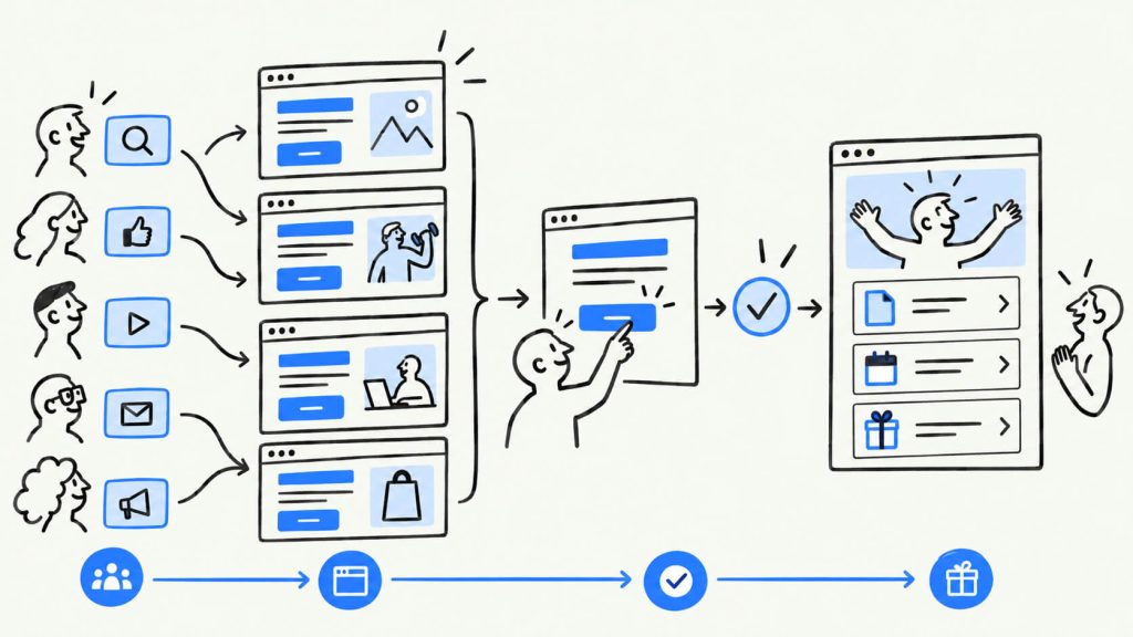
Use the page to keep things moving:
- Set expectations: Let people know what happens next and when they should expect to hear from you.
- Give them something useful to do: You could send them to a relevant resource, let them book the next call, or offer a referral incentive while they’re still engaged.
- Make it work for ecommerce: A related product can make sense here, as can a review request once the order has been delivered.
- Track the page separately: Set it up as its own step in your analytics so you can see what percentage of people who reach the page go on to take another action.
Conclusion
The post-click experience is made up of a lot of small decisions across the page. It’s page speed, message match, form length, trust signals, and what happens after someone converts, all working, or failing to work, together.
Some businesses get strong returns from paid traffic without having particularly remarkable ads. The difference often shows up after the click. Most of the people they pay to bring in end up becoming leads or customers instead of disappearing because the page was slow or the form was too much work.
Start with page speed and message match. They’re relatively straightforward to test, and the data around both gives you something concrete to work with. From there, a tool like CROLabs can show you where visitors are leaving your pages, giving you a clearer idea of what needs attention instead of picking one of the eight areas at random.
See What’s Happening After The Click
Cancel anytime.
FAQ
What’s the difference between pre-click and post-click optimization?
Pre-click optimization covers the ad itself, things like targeting, creative, bidding, and copy, with the single goal of earning a click. Once that click happens, post-click optimization takes over: the landing page, the form, the confirmation step, and anything else standing between a visitor and an actual conversion.
How do I know if my post-click experience is the problem?
Look at the gap between click-through rate and conversion rate. A healthy CTR paired with a weak conversion rate usually points to the landing page rather than the ad. Session recordings and heatmaps, available through CROLabs’ analytics or a similar tool, will show you exactly where visitors are dropping off on the page itself.
Do I need a different landing page for every ad?
Not necessarily. If your ads all target the same audience with a similar message, one well-matched page can work fine. Once you’re running multiple ad angles or targeting different segments, either build separate pages for each or use a personalization tool that adapts one page dynamically based on the traffic source.
How much can fixing the post-click experience actually improve conversions?
It depends on what’s broken, but the fixes above come with specific, documented results behind them: a 66% lift from message match in one test, a measurable conversion drop for every extra second of load time, and close to a threefold gap in form conversion based on field count alone. Fixing more than one of these tends to compound the effect rather than just add to it.
What should I fix first if I’m just getting started?
Page speed and message match. Both are relatively quick to audit, both have strong data behind their impact, and neither requires a full redesign. Once those are handled, move on to form length and trust signals.