On This Page
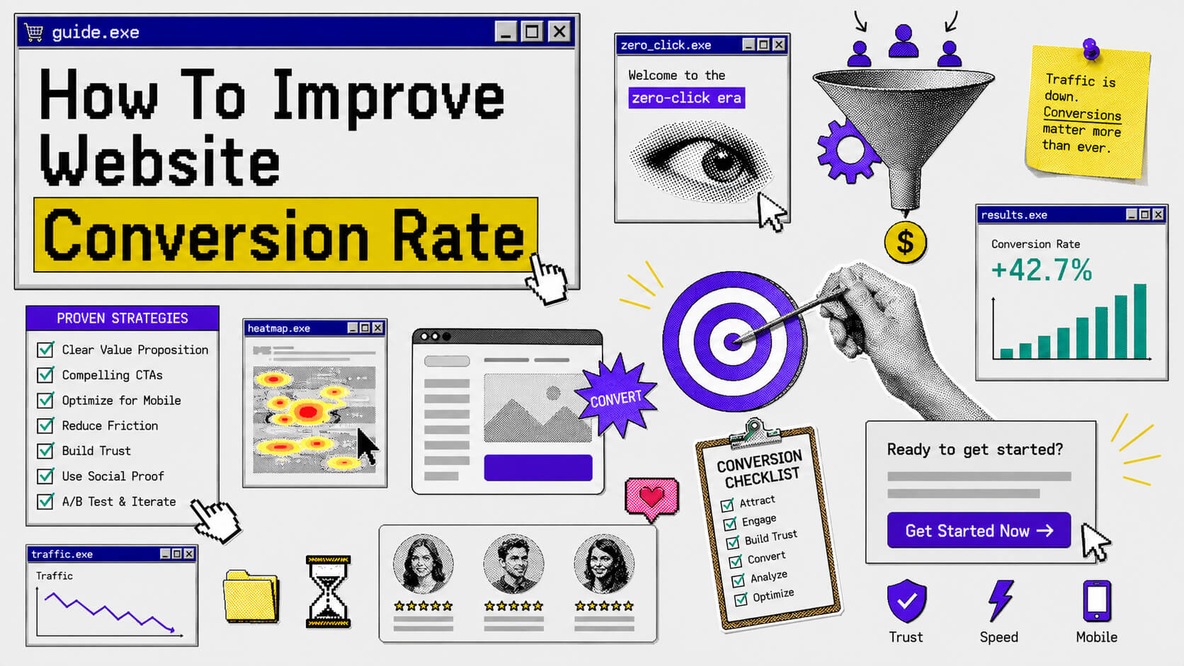
As you may have heard, we are in a zero-click era of the internet and one of the consequences of this is almost non-existent traffic. So when you do get eyes on your website, that page the visitor lands on better be able to convert.
In this article, we’ll look at different strategies you can employ to increase the likelihood of your website page(s) doing this (i.e converting).
What Is Conversion Rate?
Conversion rate is the percentage of visitors that perform a desired action on your website.
That desired action could be booking a call, downloading a resource, signing up for your newsletter, etc.
The process of improving your website’s conversion rate, which is what we’re looking at in this article, is called conversion rate optimization.
Strategies To Improve Your Website’s Conversion Rate
Alright, let’s quickly get into the tactics.
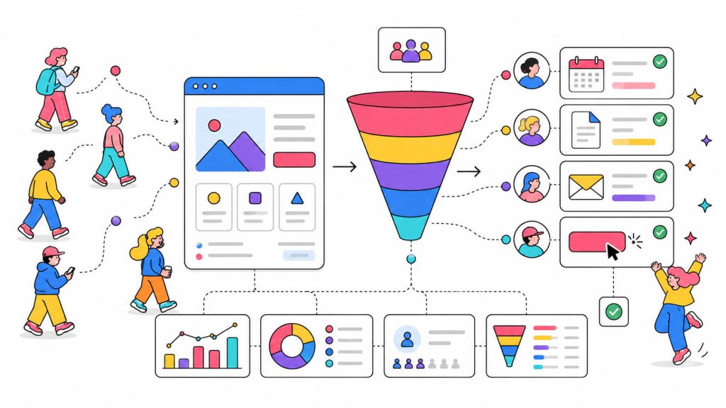
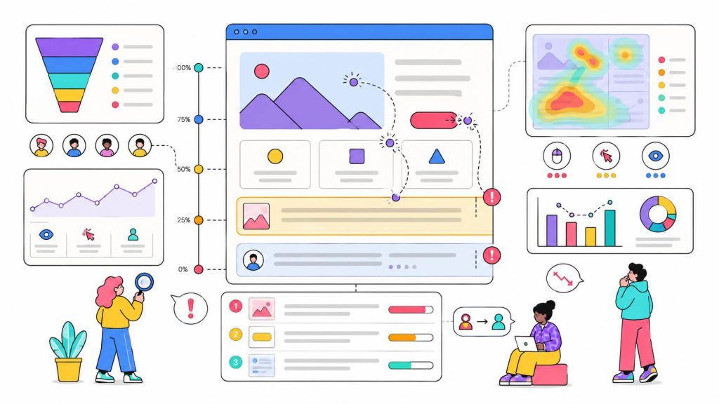
1. Get Data On What Needs Optimizing
Improving your website’s conversion rate will almost always mean changing (more like optimizing) something on the site. But you need to know what elements need to be changed, else you risk breaking what’s already working.
To get this insight, you need the help of an analytics tool. Tools like Google Analytics 4 and CROLabs help you view how your visitors interact with your website. CROLabs especially allows you to see where your visitors drop off, and gives insight into why this may have happened and how to reduce it.
So if you’re seeing that a lot of your visitors don’t go past the hero section when they land on your homepage, the hero section is a drop-off point and something needs to be changed there to improve conversions.
If this strategy is simply about knowing what needs changing, then the next one is knowing what implemented change is actually effective.
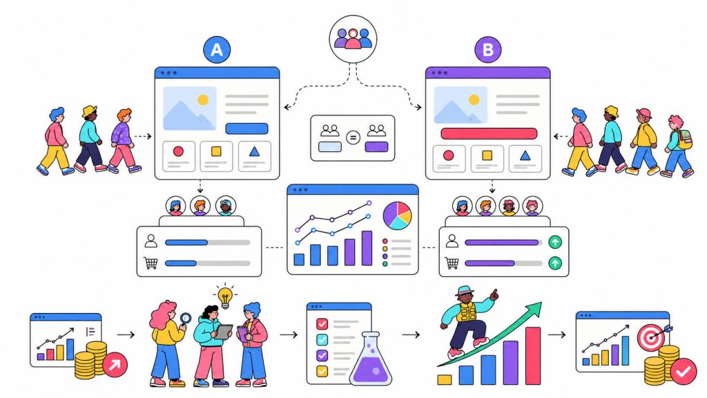
2. Run A/B Tests
The most common factor of conversion rate optimization is experimentation. You can’t always be 100% sure what will drive conversions so to get an understanding, you run tests.
A/B test or split test is one of such tests. It compares a control (version A) to a variant (version B) in order to determine which one drives more of your desired result or conversion.
Let’s say your CTA button color is red, but you think a green button will drive more conversions for your business. To know if this assumption will yield any fruit, you use a CRO tool to create and launch an a/b test. The CRO tool randomly splits and sends traffic to the A and B versions of the page to test which one (either the page with the red CTA button or the one with the green one) drives more conversions.
The thing you have to keep in mind about using this as a strategy is that it has to be continuous. To get the best possible conversion-driving website you can have, experimentations like these go on and on because the results compound.
If the green button in the example above works best for your website visitors, that’s an increase in your conversion rate. You can then move to testing another element (like the CTA text) and if the change works for your visitors, that’s an increase on top of the previous increase.
Don’t redesign blindly
3. Use Clear, Compelling Headline Copy
There’s a high chance you’ve heard this one before but many businesses need to hear it again. A lot of websites have vague headlines, like “Transforming the way you work”, that could mean anything.
You need specific headlines that communicate your value, especially above the fold. As Arsh Sanwarwala put it, “Optimizing just this one section of your website [above the fold section] will result in more people engaging with your site, and ultimately converting”.
He implemented techniques like making the CTA button “painfully obvious” and using a benefits-driven headline, which are optimizations of above-the-fold elements. This led to a 132% increase in conversions and qualified leads.
So instead of “We Help Businesses Grow”, try “Increase E-Commerce Conversions By 25% in 90 days”.
4. Reduce Friction In Your Funnel
Sure, you need their email, but do you really need their company size, number of employees, annual revenue, or phone number? Including all these as form fields just increases the chances of your visitor bouncing.
Getting someone to start filling a form is enough proof that they have, at least, a little interest in your offering. So if all that information is relevant for your business, you can get it after they’ve signed up and become more invested in your product or service.
Along with reducing the number of form fields, things like reducing page load time and delaying pop-ups are ways you can reduce friction for your visitors, and consequently improve your conversion rate.

Turn more traffic into customers
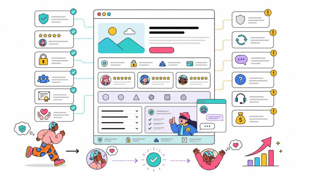
5. Build Trust Immediately
To do this correctly, you have to use proof, especially social proof, that actually means something. If you landed on a website that just says “join 100,000+ users”, wouldn’t you be a bit skeptical? There’s no way to verify if there’s some truth to this and even if the numbers are true, are those happy users?
It’s these thoughts that go through your visitors’ minds as well. So to improve your website’s conversion rate, you can include trust signals like testimonials that focus on outcomes.
Other trust signals include:
- Social proof: Customer logos (especially of notable companies), testimonials (especially video testimonials), reviews (especially linked reviews of trusted review sites like Google, G2, Trustpilot), case studies. These tell new visitors that others like them have already tested and trusted you.
- Security signals. HTTPS, trust badges (like the GDPR-Compliant badge), payment security logos, privacy policy link. Especially important if you’re asking for personal information or payment.
- Quality content. Thin content and grammatical errors immediately erodes trust. Content that’s thorough and genuinely helpful builds it.
- Professional design. A poorly designed website signals that the business behind it might not be trustworthy. This might not be fair, but it’s real.
6. Address Your Visitors’ Objections Head-on
We’ve established that there’s a reason (or multiple reasons) people leave your site without converting. But before they leave, you have one last chance to grab them.
Exit-intent pop-ups are one way to do that. They trigger when a user moves their mouse toward the back button or closes the tab. You can turn them into surveys that ask your visitors why they want to leave (not in a demanding way, of course), and for an email you can reach them on to address this.
You can also use customer support chat bots to answer whatever questions your visitors may have. Other common objections and where to address them are:
- “Is this actually secure?” → Trust badges and security policy in footer
- “How long does this take to set up?” → Timeline in your features section
- “Can I get my money back?” → Money-back guarantee above the fold
- “Do I need to be technical?” → FAQ addressing skill requirements
Tools That Help You Improve Conversion Rate
The best CRO tools show you exactly where people are dropping off, and validate what fixes will actually work.
CROLabs
An AI-powered CRO platform that audits your pages, identifies friction points, and lets you run A/B tests without developer involvement.
The AI Advisor crawls your site and validates which issues are actually costing you conversions based on industry benchmarks. You get a prioritized list of what to fix first.
Hotjar
Best for heatmaps and session recordings. See where visitors click, how far they scroll, where they get stuck.
Google Analytics 4
Free and essential. Set up funnel exploration to see exactly where visitors drop off.
Conclusion
Modern CRO tools like CROLabs have ensured that improving your conversion rate doesn’t require a massive budget, a development team, or a year-long project. For most businesses, especially those starting out, Google Analytics (free) + CROLabs (free tier available) is a great combo for this. You can get started here.
Try CROLabs Free
No credit card required · Cancel anytime