One of the best ways to show the value of something is by showing proof it works. And that’s why, to demonstrate the many benefits of website personalization, we’re giving you 12 real-world examples of it in action, from brands you’ve definitely heard of and quite a few you probably haven’t.
And because knowing isn’t the same as doing, each one comes with a section on how to actually pull off something similar using CROLabs.
Before we get into the real-life examples, here are some things you should know about website personalization first:
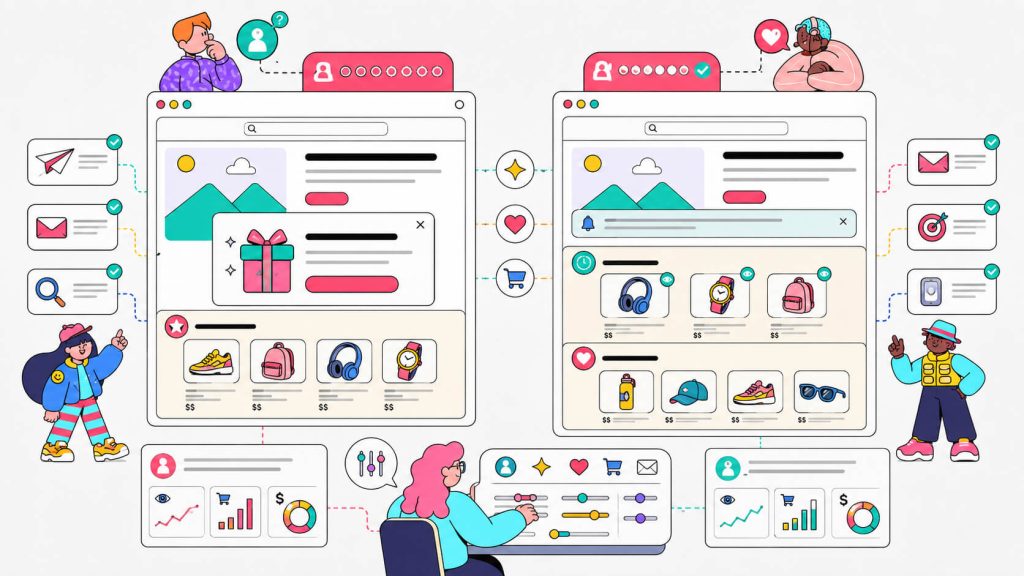
- Personalization isn’t a redesign: It’s swapping one specific element (a headline, a recommendation block, a popup) for one specific segment. Most of the examples below started as a single change on a single page.
- Segment before you personalize: You may think showing everyone something different is a strategy, but it’s actually chaos. Pick one segment (mobile visitors, paid traffic, first-time buyers) and build for them first.
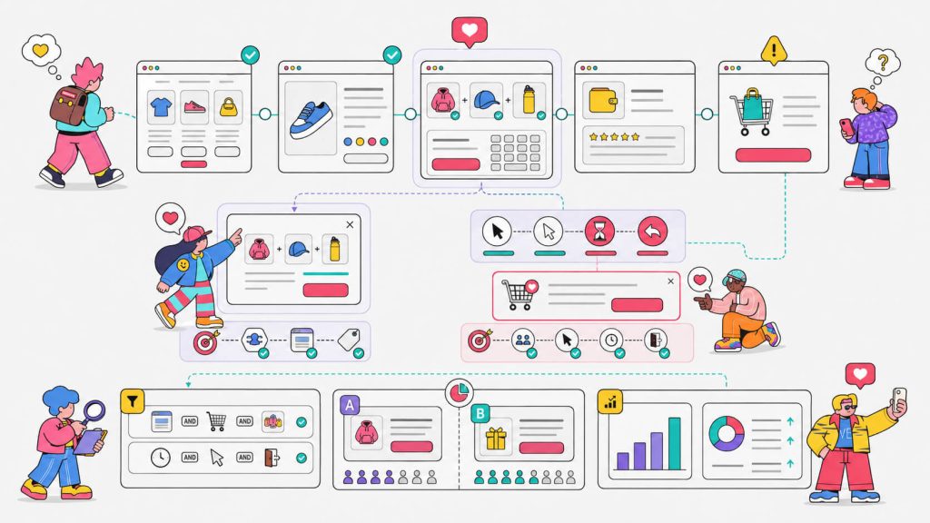
- If you’re not measuring against a control group, you’re guessing: Every brand in this article ran their personalized version against a holdback or an A/B test. Without that, you don’t actually know if the personalized version is winning or if you just got lucky with traffic that week.
- The signals you already have are enough to start: Device type, traffic source, and page-level behavior will get you most of the way to the wins below.
- Personalization wins compound: When you fix one friction point, the next one becomes visible. Several brands below stacked three or four small wins into a much bigger overall lift.
- You don’t need a developer for this anymore: Every example below was either built with a no-code tool or is achievable with one. That includes CROLabs’ Visual Editor, which is exactly the point of this article.
Alright, let’s get into the examples.
On This Page
1. Anothersole’s Mobile Journey Optimization
Anothersole, a global footwear and lifestyle brand, noticed strong mobile traffic that wasn’t converting the way it should.
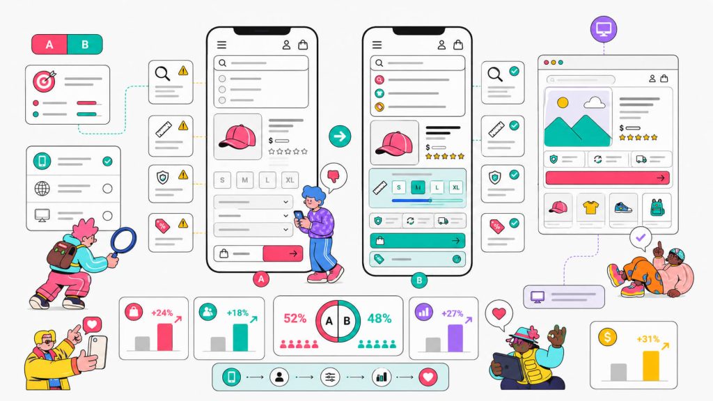
Working with the agency ConvertPolo, they ran three separate tests. The first test was adding popular-search prompts to a search bar that previously gave no guidance. The second one was moving sizing guides and trust signals higher up on the product page, and the third was merging a two-step cart-and-discount-code flow into one.
Per Anothersole’s case study, the combined result was a 185% increase in revenue, a 22% rise in add-to-cart actions, and a 131% revenue lift from the cart-flow change alone.
None of these were personalization in the segment-targeting sense. They were device-specific fixes i.e changes built for and tested on mobile visitors specifically, because that’s where the friction was.
How To Implement This With CROLabs
If you want to be like Anothersole and give mobile users a more personalized experience, set your experiment’s device targeting to mobile only, so desktop visitors aren’t diluting your results with a page they never actually see the change on.
Then, use the Visual Editor to rebuild the section you’re testing (search bar, product page layout, cart flow) without waiting on a developer, and run it as an A/B test against the current mobile experience.
You can track add-to-cart rate and revenue per visitor in Conversion Tracking. And if you’re not sure which friction point to tackle first, the AI Advisor will crawl your site and flag what’s costing you the most conversions relative to industry benchmarks. This way, you’re fixing the search bar before the checkout flow if that’s actually where the bigger leak is.
2. Booking.com’s Urgency and Social Proof Messaging
Booking.com is basically a masterclass in showing you information that makes you anxious enough to book right now. They’ve used labels like “Only 2 rooms left at this price”, “Booked 14 times in the last hour”, “In high demand” and so on.
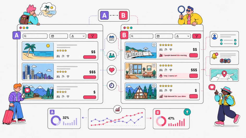
Though they look like the typical fake urgency phrases brands employ, these aren’t actually static labels. They’re pulled dynamically based on real (or at least real-adjacent) demand signals and shown differently depending on the property, the dates, and how close you are to checkout. Personizely’s breakdown of Booking.com’s personalization covers this in more depth if you want to see it dissected property by property.
What makes it work isn’t the scarcity trick alone since plenty of sites use fake urgency and it backfires. It’s that Booking.com ties the message to something plausible and specific to that listing, at that moment, for that visitor.
How To Implement This With CROLabs
Use the Visual Editor to add a trust or urgency element (a viewer count, a “booked recently” note, a limited-availability flag) to a handful of your highest-traffic product or listing pages (you don’t need a dev ticket for this).
Then, run it as an A/B test against your current page so you’re comparing apples to apples. You can also turn on Conversion Tracking on the “book now” or “add to cart” click so you know if it’s just impressions or if the change is actually moving people.
Again, if you’ve got a lot of pages to prioritize, the AI Advisor can flag which ones are leaking the most conversions first so you can start there.
3. Netflix’s Personalized Artwork
You might not know this, but Netflix employs personalization for its users. Especially, personalizing the thumbnails. The same title, say Stranger Things, gets a completely different cover image depending on whether you watch a lot of horror or a lot of comedy.
Netflix’s own engineering team has written about how they validate these choices through, wait for it, A/B testing thumbnail artwork rather than assuming one image works for everyone.
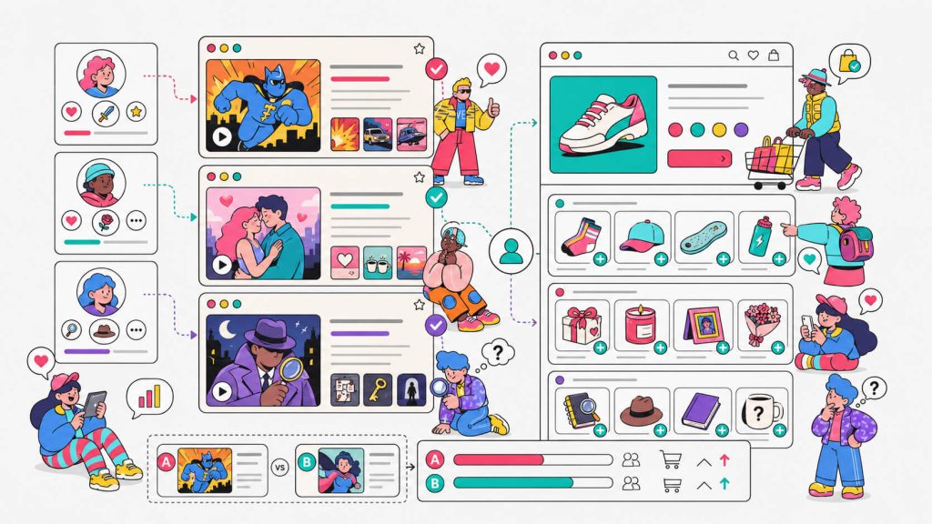
Personalization at Netflix’s scale is still just experimentation, run over and over, for smaller and smaller audience slices.
How To Implement This With CROLabs
You can run A/B tests or multivariate tests on your homepage hero. For multivariate tests, you can test different images and headline combinations against each other, and use the Personalization targeting to split results by device (a hero that reads well on desktop might get cropped awkwardly on mobile) or by referrer, so you can see whether paid traffic responds to a different message than organic visitors.
4. Amazon’s “Customers Who Bought This Also Bought”
You might already know this one. It’s the reason Amazon can put an $8 phone case next to a $1,200 laptop and have it feel relevant instead of random.
This rundown of Amazon’s personalization approach points out that this single feature is estimated to drive a significant chunk of Amazon’s total sales, and it’s been copied by basically every ecommerce site since.
What people miss is that Amazon runs this everywhere, including product pages, cart, post-purchase emails, even the homepage. We can safely categorize this as a system for Amazon.
How To Implement This With CROLabs
Obviously, you have to start smaller than Amazon. Use the Visual Editor to add a “frequently bought together” or “you might also like” block to your product pages (no code required for this) and A/B test its presence against a control group that doesn’t see it.
You can track what’s happening by watching average order value and revenue per visitor in Conversion Tracking. If it wins on desktop but does nothing on mobile (which happens more than people expect, thanks to smaller screens crowding out the block), device targeting lets you keep it live for one and pull it for the other instead of killing the whole test.
5. Spotify’s Taste-Based Onboarding
New Spotify users get asked to pick a few favorite artists before they even see the homepage. That single interaction seeds everything that follows: Discover Weekly, Release Radar, the Made For You shelf.
Spotify’s own VP of Personalization has explained how this works, and the core idea is simply to ask a small question upfront, then use the answer to shape everything downstream.
How To Implement This With CROLabs
This is a great pattern to steal even outside of music. Build a short preference question (industry, use case, budget range, whatever’s relevant) into your signup or onboarding flow using the Visual Editor, and A/B test it against your current no-question flow.
You then track completion rate through Conversion Tracking, because the risk with any extra step is that it adds friction instead of removing it. If you’re worried it’ll only help certain traffic, target the test to first-time visitors coming from a specific campaign referrer so you’re not adding friction for people who’ve already converted once before.
6. Pierre Hardy’s AI Recommendations Across Every Surface
Pierre Hardy, the French luxury shoe and accessories house, runs several recommendation widgets. They’re tuned differently depending on where you are, like best sellers in the onsite feed for new visitors, recently-viewed reminders for returning ones, and “frequently bought together” suggestions that respond to what’s actually sitting in your cart right now. There’s also a “complete your look” block embedded right next to the cart, at the exact moment someone’s deciding whether to check out or keep browsing.
What’s smart here is the placement logic. The recommendation is accurate and it shows up at the moment it’s actually useful.
How To Implement This With CROLabs
Almost every implementation starts with the Visual Editor to make the process easy. So, as usual, use the Visual Editor to embed a recommendation or “complete the look” block near your cart or checkout page. Then A/B test it against your current checkout flow.
You can set Conversion Tracking to watch average order value specifically, since that’s the metric this kind of placement is designed to move. If you’ve got limited dev bandwidth and can only test one placement first, the AI Advisor can help you figure out whether your biggest drop-off is happening on the product page or in the cart, so you place the block where it’ll actually matter.
7. Maison Lejaby’s New-vs-Returning Visitor Recommendations
Maison Lejaby, a French luxury lingerie brand, shows completely different recommendation logic depending on whether you’ve been to the site before.
It shows best sellers for newcomers, “recently viewed” reminders for people who’ve been browsing, and cross-category suggestions that nudge returning shoppers toward completing a set. Their case study shows how much of this runs on autopilot once it’s set up.
How To Implement This With CROLabs
Full transparency here, dedicated new-vs-returning visitor targeting isn’t live in CROLabs yet. However, what you can do today is approximate it.
Use referrer targeting to isolate visitors coming from an email campaign or retargeting ad (who are almost always returning customers) and run a different Visual Editor variant for that segment than what your organic, first-touch traffic sees.
8. Yespark’s Visitor-Type Lead Capture
Yespark, a French parking rental company, splits its lead capture by visitor type. First-timers get a full-page welcome popup offering money off their first month and returning visitors get a quieter bottom bar with the same offer instead of getting interrupted a second time.
According to Yespark’s case study, the popup alone pulled in close to 3,500 emails, and the bar added over 1,200 more from people who’d already seen the welcome message once.
The lesson to learn from Yespark is that showing the same interruption twice to the same person is how you train people to ignore you.
How To Implement This With CROLabs
Full transparency here once again, true new-vs-returning targeting isn’t yet live on CROLabs.
In the meantime, you can build both formats (a bolder first-touch version and a lighter repeat-visitor version) with the Visual Editor, and use referrer or device targeting to split traffic where you can. Run each as its own A/B test against no-popup-at-all, since that’s the comparison that actually tells you whether the tactic works.
9. émoi émoi’s Add-to-Cart Upsells
émoi émoi, a French family lifestyle brand, places two different upsell offers directly under the add-to-cart button. One is a free gift box with a purchase, and the other is a free chain for adding two or more products.
Because the offer complements what’s already in the cart instead of being a random suggestion, émoi émoi reports a 23% lift in average order value.
How To Implement This With CROLabs
Use the Visual Editor to add a cross-sell or bundle offer underneath your add-to-cart button, and run it as an A/B test against your current product page.
Then, set Conversion Tracking on average order value and revenue per visitor to see if this is getting people to buy more per order.
10. Emma Sleep’s A/B Tested Signup Flow
Emma Sleep, a D2C sleep brand selling in more than 20 markets, didn’t assume a multi-step signup form would outperform a single-step one. They tested it, by showing an interest-selector step before the email field versus jumping straight to email. According to Emma Sleep’s case study, the multi-step version increased subscription rate by 50%.
How To Implement This With CROLabs
This is squarely what A/B Testing is built for. Use the Visual Editor to build a multi-step version of your signup or lead form, then run it head-to-head against your current single-step version.
You can watch completion rate in Conversion Tracking, and let the test run long enough to reach significance before calling a winner. If your team is testing across a lot of pages at once, Analytics will show you where signup drop-off is worst so you can test the flow that actually needs it.
11. MakerFlo’s Page-Specific Behavioral Popup
MakerFlo runs a popup only on its bundle-builder page, on the logic that anyone who’s navigated there has already shown intent to explore that specific mechanic, so they’re pre-qualified before the popup even appears.
MakerFlo’s case study shows that targeting just that one page produced a 22.9% click-through rate, well above what a site-wide popup usually manages.
How To Implement This With CROLabs
You can do this exactly as described. Every CROLabs experiment is built against the specific page or URL you choose, so running a variant only on your highest-intent page (a bundle builder, a comparison page, a pricing calculator) is the default.
Use the Visual Editor to add the offer to that page specifically, A/B test it against the page without it, and check Conversion Tracking on impressions, click-through and downstream conversion.
12. 4murs’s Predictive Cart Recovery
4murs runs an AI-powered cart recovery popup that doesn’t fire on a fixed timer. Instead, it reads behavioral signals during the session and only surfaces a recovery offer when the system predicts the cart is actually at risk of being abandoned.
Per 4murs’s case study, the popup reached a 24.5% click-through rate against zero in the control group that saw nothing.
How To Implement This With CROLabs
You can run a simpler version of this with CROLabs. First, build a static cart-recovery banner or offer with the Visual Editor that shows to everyone who reaches the cart page. Then, A/B test it against a cart page with no offer at all.
It’s rule-based instead of predictive, but a 24.5% click-through rate against a control of zero mostly tells you the offer works.
Conclusion
Most of the examples above started as one change that was tested on one segment on a page. And that’s the whole philosophy behind CROLabs.
You get A/B testing, multivariate testing, and personalization that’s reasonably priced and doesn’t require a developer, an AI Advisor that tells you where to start instead of leaving you staring at a blank experiment builder, and conversion tracking that tells you honestly whether a change worked instead of letting you assume it did.
If any of the examples above sound like something your site is missing, that’s a good place to start. Try CROLabs free for 14 days, no credit card required, and see what you’re currently leaving on the tabler.
Ready to create personalized experiences that convert?
✓ AI-powered behavior analysis
✓ Heatmaps & session recordings
✓ Conversion insights & recommendations
✓ Fast setup with no complicated implementation