Updated Nov 2026
Between 2019 and 2024, the average number of fields in an online checkout form fell from 12.7 to 11.3. That’s a reduction of just 1.4 fields over five years. The same research suggests that around eight fields are enough for most checkouts, which means the average site still asks shoppers to fill in roughly three extra fields. Each additional field takes a little more time and effort, and it gives people another reason to abandon the process before completing their purchase.
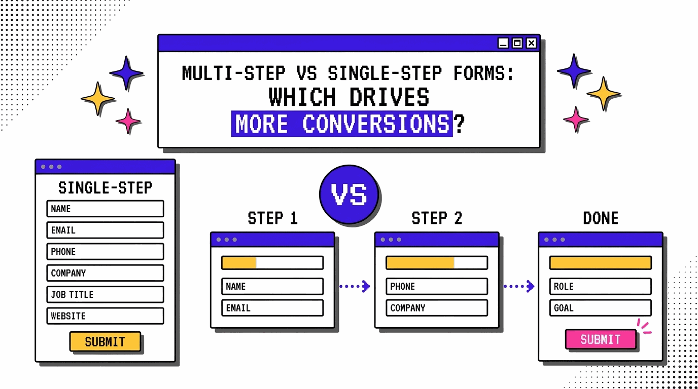
This is why form design deserves attention when you’re working to improve conversions. A form often comes at the point where someone is ready to sign up, request a quote or make a purchase, so the way you ask for their information can affect whether they follow through. One decision you’ll need to make is how to arrange those fields. You could put everything on a single screen, or break the form into smaller steps that visitors complete one after another. Both approaches have their place, and the better option depends on what you’re asking people to do. In this article, we’ll look at how single-step and multi-step forms work, what makes each one effective, and how you can compare their performance on your own website using CROLabs.
On This Page
In short
- A single-step form puts every field on one screen and suits 1 to 5 fields.
- A multi-step form splits 6 or more fields across 2 to 4+ screens.
- Baymard’s research ties form usability to how many fields a person faces, and step count matters less.
- An A/B test on your own traffic is the surest way to pick a winner.
How Single-Step and Multi-Step Forms Differ
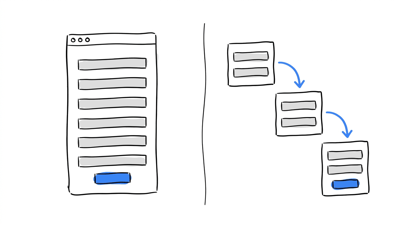
A single-step form shows every field on one page or screen while a multi-step form breaks the same fields into a sequence of 2 to 4+ screens, causing the visitor to move through them one at a time.
Choosing between them depends mostly on field count, user intent, and complexity. Field count has the cleanest rule of thumb because intent and complexity take a little judgment. A visitor booking a flight will put up with more questions than one downloading a checklist, and a form where later questions depend on earlier answers (a roof type that decides which panel sizes to ask about, for example) fits more naturally into steps.
When a Single-Step Form Is the Better Pick
When you put everything on one screen, the visitor fully sees what’s required of them before they have to type a single character. That openness suits short forms.
- Best field count: 1 to 5 fields, with 3 or fewer being ideal.
- Best use cases: simple contact requests, newsletter sign-ups, event RSVPs and basic resource downloads.
- Advantages:
- Fast and transparent, since visitors see everything required right away.
- No step-transition friction on a short ask.
- Disadvantages:
- Forms with 6+ fields bring cognitive overload and heavy drop-off.
- Nothing gets captured if a visitor leaves halfway.
Single-step forms work for flows like a newsletter box with one email field because it has little to gain from being split up. Adding a second screen would only add a tap.
When a Multi-Step Form Earns Its Extra Clicks
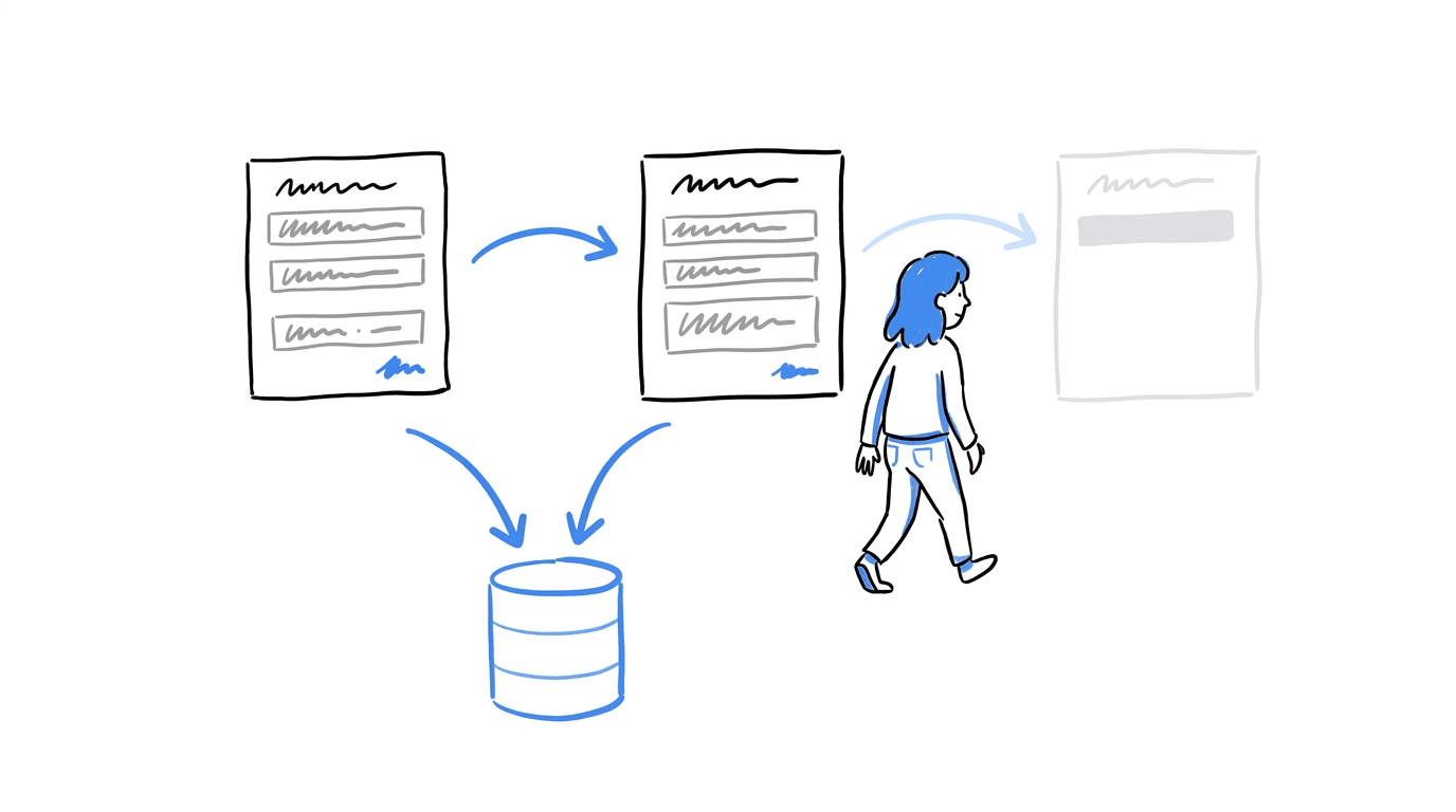
Each screen in a multi-step form asks for a small piece of the information, and the visitor answers before moving on.
Multi-step forms are obviously going to be longer forms, but there are some best practices you should adhere to.
- Best field count: 6 or more fields, often 8+.
- Best use cases: detailed lead generation, quote or estimation requests, job applications, onboarding flows and booking systems.
- Advantages:
- Reduced perceived effort. Bite-sized chunks are easier to get through than one long list of fields.
- Micro-commitments. Start with easy, low-friction questions like clickable choices, and save sensitive details such as phone numbers or income for later steps.
- Partial lead capture. Data saves step by step, so you can follow up even when someone drops off.
- Better mobile experience. Each screen needs far less vertical scrolling.
- Disadvantages:
- Extra setup, plus a clear progress bar so visitors know where they are.
- Added taps and clicks when the form only has 2 fields.
Ready to find out which form converts better?
With CROLabs, you can create A/B tests, track form submissions and see how visitors interact with your pages. Compare both layouts using your own traffic and use the results to decide what works.
The Number on the Screen Counts More Than the Number of Screens
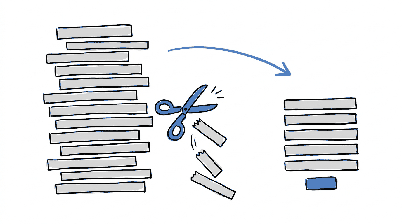
Baymard’s checkout research offers a useful starting point for understanding what makes forms easier to complete. Its 2024 benchmark found that the average checkout contained 11.3 form fields spread across 5.1 steps, while around eight fields were enough for most sites. The number of questions shoppers had to answer played a bigger role in usability than the number of screens they moved through.
Although this research focuses on online checkouts, the same principle applies to lead generation forms. Say you’re asking visitors to complete 14 fields and decide to divide them across four screens. They’ll see fewer questions at once, which can make the form feel easier to approach.
However, they’ll still have to provide all 14 answers before they can submit it. Removing unnecessary fields reduces the amount of information they need to enter.
There’s also a clear business cost when a form takes too much effort to complete. Baymard also found that 17% of US online shoppers had abandoned an order because the checkout process felt too long or complicated. That gives you an idea of how much friction a lengthy form can introduce, especially when someone is already close to making a purchase.
With that in mind, review your form field by field before deciding how to arrange it. Look at what your team does with each answer and whether you need that information to move a lead or customer forward. For instance, if a field rarely gets used by your sales team, you can probably remove it. You may find that a form with nine fields only needs five, which gives you a much better starting point for choosing between a single-step and multi-step layout.
Why a Head Start Makes People Finish Forms
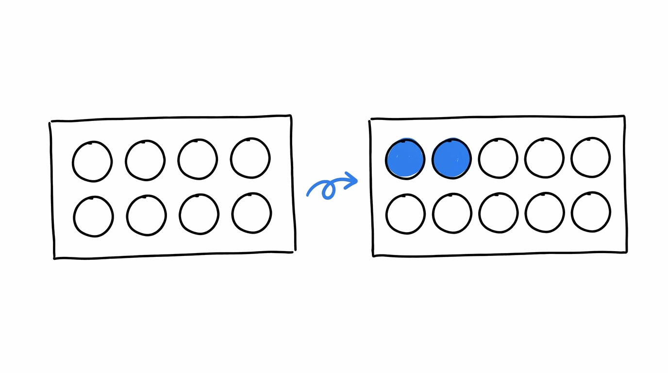
In 2006, researchers Joseph Nunes and Xavier Drèze gave car wash customers one of two loyalty cards. One was blank and needed 8 stamps. The other needed 10 stamps but came with 2 already filled in. Both cards took 8 more purchases to complete, and the card with the head start got finished at a higher rate. That study comes up often in form progress bar research.
A progress bar on a multi-step form puts the same idea to work. Someone who sees step 1 of 4 already done has something to lose by leaving. A few things decide whether the bar helps or gets in the way:
- Use it on forms that take more than 60 seconds to finish. Shorter forms don’t build up enough worry about remaining effort to need one.
- Make the progress accurate. If you can’t show where a visitor stands, skip the indicator.
- Check the pace. On a 10-step form where the bar barely moves after three steps, motivation drops.
- Open with an easy step, such as one clickable choice, so the bar fills quickly.
Where to Put the Question Nobody Wants to Answer
Every form has one. It might be a phone number, a budget range or a company’s annual revenue. Multi-step forms give that question a better home, and the last screen is it, after visitors have answered the easy ones and have some progress behind them.
Take a solar installer’s quote request. Screen one could be a single tap on roof type. Screen two could ask for an address and a monthly electricity bill, and the phone number could wait until screen three. Each screen asks a little more than the one before it.
Getting the email first and the rest later is one of the ways to reduce friction in your funnel, and it fits with the data minimization principle in the GDPR, which says to collect only the data strictly needed for the stated purpose. If a field exists because someone might find it handy later, it can come out. And if the form feeds into your marketing stack, we’ve put together a list of GDPR-compliant marketing tools worth a look.
Want to see where visitors struggle with your forms?
CROLabs combines heatmaps, analytics and AI-powered website audits to help you spot friction points across your pages. You can use those insights to decide which parts of your form need attention.
Single-Step vs Multi-Step Forms at a Glance
| Feature | Single-Step Form | Multi-Step Form |
|---|---|---|
| Structure | All fields on one page | Fields split across sequential steps |
| Ideal size | 1 to 5 fields | 6+ fields (best at 8+) |
| Best for | Contact requests, newsletter sign-ups, RSVPs, downloads | Quotes, job applications, onboarding, bookings |
| Drop-off data | Lost on exit | Captured per completed step |
| Sensitivity handling | All fields exposed at once | Sensitive data deferred to later steps |
How to Test Which Form Wins on Your Site
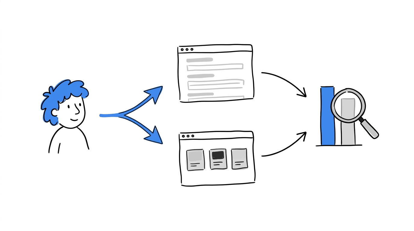
A rule of thumb gets you to a starting layout. Your own visitors decide the rest, and an A/B test is how you hear from them. Here’s how that goes in CROLabs:
- Find where visitors leave. Analytics & Heatmaps shows where people drop off on a page, and the AI Advisor crawls your site to flag friction points. That tells you whether the form is the problem or something above it.
- Set your goal. Use Conversion Tracking to count form submissions as the conversion.
- Build both versions. Keep the single-step form as your control and create the multi-step version as the variant. If you want to adjust the headline or button text around the form, the Visual Editor lets you do it without code.
- Split the traffic. A/B Testing sends visitors to each version at random. Let it run until the result is reliable, because stopping early is how false positives slip in.
- Check lead quality. A multi-step form can lift the number of submissions, so compare how many of those leads become customers before you call a winner.
Once the layout is settled, multivariate testing lets you test combinations such as field order and button text together. You can try all of this on the 14-day free trial, and no credit card is required.
Conclusion
If your form has 5 fields or fewer, a single step keeps things quick. Past 6 fields, splitting it into 2 to 4 screens gives visitors smaller pieces to work through, and it gives you partial data when someone leaves midway. In both cases, trim the fields first, since Baymard’s research puts field count ahead of step count.
Your audience has its own habits, so a test on your own traffic is worth running before you commit. You can start a free CROLabs trial and put the two layouts side by side.
FAQs