Updated Aug 2026
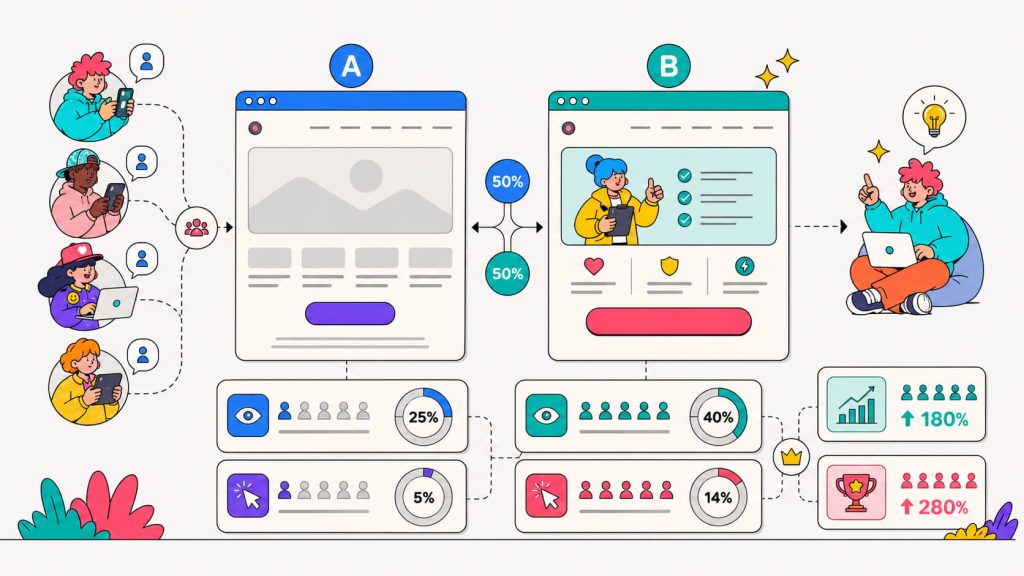
As Unbounce put it once, A/B testing is simply about finding ways to get more out of the same investment.
There are different ways to do this, but you wouldn’t know with the way a/b testing ideas always seem to only involve button colors or CTA tweaks.
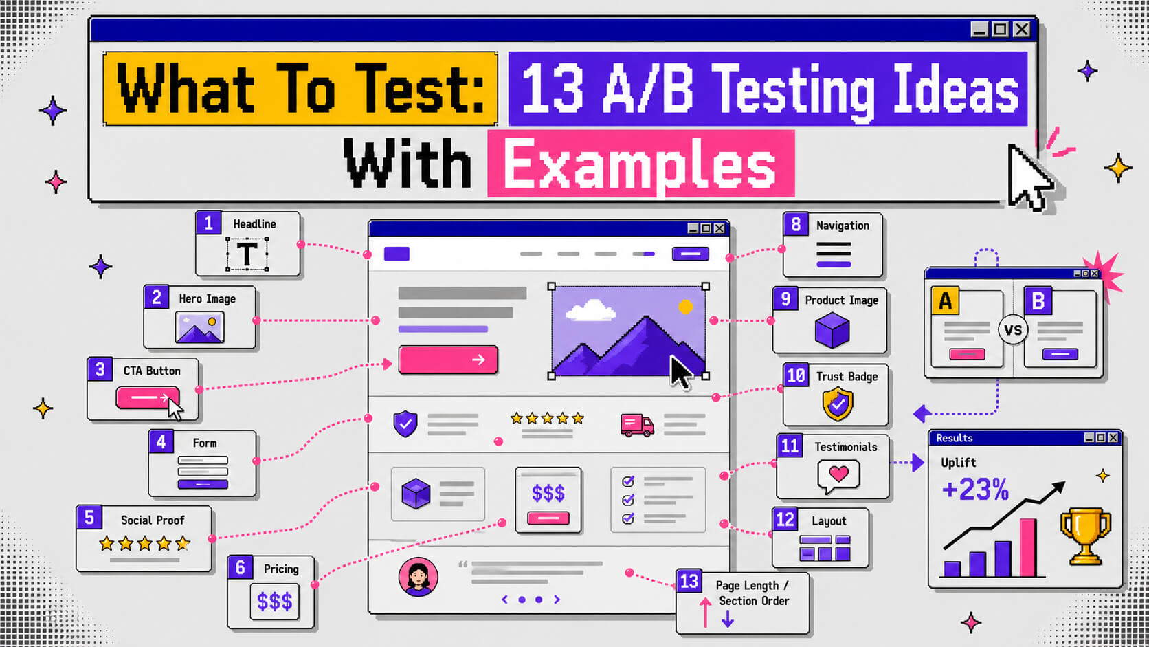
We’ve put together thirteen a/b test ideas, and they’re grouped by the part of the page they touch. Each category comes with real examples and the numbers behind them, so you can pull whichever category matches where your analytics show the most drop-off and start there.
Good a/b testing ideas come from data. Watching what a competitor happens to be running is a weaker starting signal, since you have no idea whether their test won or lost.
On This Page
Above-the-Fold Tests
Above-the-fold is the section a visitor sees before scrolling. It’s also the section that has the most impact on whether they stay or bounce.
According to a HubSpot analysis cited by Webinopoly, CTAs placed above the fold convert around 17% higher than the same CTA placed below it. This is why this category sits first on almost every list of a/b testing ideas worth running.
1. Headline Copy
Most homepage headlines say something like “Transforming the way you work”, which could describe a thousand different companies. A headline test swaps vague language for something specific like a number, an outcome or a timeframe.
2. Hero CTA Visibility and Hierarchy
This is less about the button’s color and more about whether it’s competing with five other elements for attention. A hero section with one clear action usually beats one stuffed with a video, a form, and three links.
Example
Instead of several competing links, CRO consultant Arsh Sanwarwala rebuilt a client’s above-the-fold section by pairing a benefits-driven headline with a single, unmissable CTA button.
He swapped “We Help Businesses Grow” for a headline that named a specific, measurable result. That led to a 132% increase in qualified leads. This lift came from combining a headline that said something concrete and a hero section with one obvious next step.
Find Out What’s Costing You Conversions
Cancel anytime.
Call-to-Action Tests
We tend to view CTA testing as a formality, like it’s something you check off before moving to bigger changes. But the words on a button carry more weight than most people assume. It’s one of the highest-impact items on any list of a/b testing ideas, and that’s mostly because it’s fast to build and fast to read results on.
3. Button Copy
Generic phrases like “Submit” or “Learn More” tell a visitor almost nothing about what happens next. As always, specific, first-person copy tends to outperform it because it removes the guessing.
4. Button Design and Placement
Color, size, and whitespace around a CTA all affect whether it gets noticed. This test matters most when a page has multiple buttons competing for the same click.
Examples
37signals ran a well-documented test on their Highrise product, where they replaced “Free Trial” copy with “See Plans and Pricing”. Their user signups increased by roughly 200%. The team’s read was that “free trial” quietly implied a future commitment, while “see plans and pricing” felt lower-risk to click.
On the personalization side, HubSpot’s analysis of over 330,000 CTAs found that personalized calls-to-action (i.e ones that change based on who’s looking at them) convert 202% better than static, one-size-fits-all buttons.
Visual Tests
Copy gets most of the attention in CRO conversations but the visual layer, such as images, video, color, and layout, is doing just as much work before a visitor reads a single word.
This category covers some essentials a visitor processes before the text even registers.
5. Hero Images and Product Visuals
If you’re using a generic stock photo on your page, that signals nothing about your product. A specific, on-brand image does more work in the same amount of screen space.
6. Video vs. Static Content
Video isn’t automatically better than a static image, but we recommend that you consider testing on pages where a visitor needs to understand a process or see a product in motion before they’ll commit.
7. Color Scheme and Contrast
Color choice matters less than most CRO advice suggests. What moves the number more is the contrast between the CTA and everything around it.
Examples
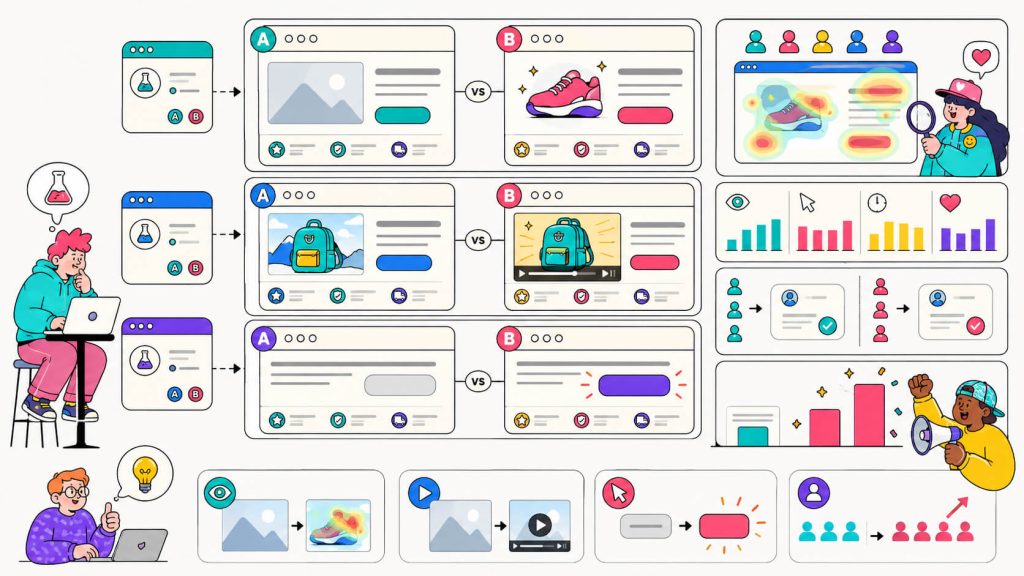
Home decor brand WallMonkeys swapped a generic stock photo for a more playful, on-brand product image and saw conversions jump by 27%. Encouraged by the result, they replaced a homepage image slider with a prominent search bar and saw a 550% lift on that specific change.
On video, HubSpot Academy tested three homepage variants. One had a static hero, another had vibrant colors and a dynamic headline, and the last one had animation layered on top. The colorful, dynamic-headline version won, lifting signups by 6% and projecting 375 additional monthly signups at scale.
Separately, Unbounce’s video benchmarking found that landing pages with video can convert up to 80% higher than pages without it, though results vary heavily by product and audience.
On color, the famous 2011 HubSpot test that CXL later broke down in detail found a red CTA button outperformed a green one by 21%. CXL’s own analysis points out the real driver wasn’t red itself. The surrounding page design was dominated by green, so the red button won mainly on contrast, with color psychology playing a much smaller role than the case study’s reputation suggests.
Form and Friction Tests
Every extra field on a form is likely costing you visitors. They tend to lose patience before they finish, and form-related a/b test ideas are where a lot of teams see the fastest movement in conversion rate. We go deeper on this in how to improve website conversion rate, which covers friction beyond forms too.
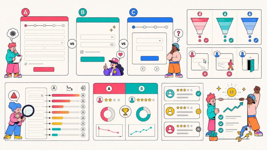
8. Number of Form Fields
A lot of website visitors are only mildly curious, so asking for a name, email, phone number, company size, and job title upfront is a big conversion blocker. Ask for less, and more people get through the door.
9. Single-Step vs. Multi-Step Forms
Instead of showing every field at once, a multi-step form reveals one or two fields at a time. It feels shorter even when it collects the same information.
Examples
Research cited by GetMonetizely found that cutting a form from 11 fields to 4 increased conversions by 120%.
A smaller, sharper cut produces a similar pattern. Incrementors documented a case where trimming a form from 4 fields to 3 alone produced a 50% lift, which says something about how steep the drop-off curve gets once you’re past the essentials.
On the multi-step side, the same GetMonetizely piece cites ConversionXL research showing multi-step forms can increase conversions by up to 300% compared to the same fields shown all at once, since each individual step reads as a small, achievable commitment rather than one long form.
You should keep in mind though that form length isn’t a universal rule. CXL’s own research on the topic found cases where reducing fields hurt conversions, because the fields removed were ones visitors were engaged with. So test your specific form and don’t assume shorter always wins.
Trust and Social Proof Tests
Visitors who don’t trust you won’t convert, no matter how good your headline or CTA is. And that’s why you need testimonials, badges, and review counts, to do the trust work.
Most teams under-test this category because trust feels subjective, but among A/B testing ideas, trust signals move numbers the same way a headline or a button does.
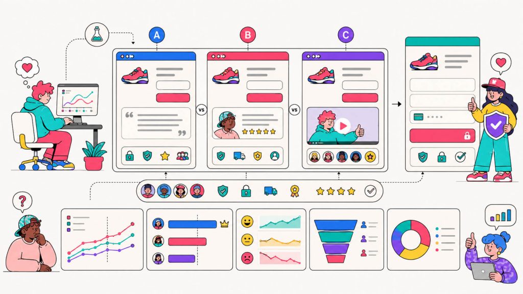
10. Testimonial Format and Placement
A block of text saying “great product, would recommend” barely registers with a skeptical visitor. A short video of a real customer describing their specific problem and outcome does more, and where you place it on the page changes how many people ever get to it.
11. Trust Badges and Security Signals
Payment security logos, privacy policy links, and compliance badges matter most on pages where you’re asking for money or sensitive information. Their absence raises doubt even if a visitor can’t name why.
Examples
Video testimonials in particular carry a lot of weight. A research summarized by Teleprompter found testimonials can increase conversions on sales pages by as much as 34% in VWO’s own A/B testing, and a separate Unbounce case study reported an 80% lift after replacing static text reviews with video on a single landing page.
On security signals, VeriSign’s own case study, which was documented by MonetizePros, found that adding a trust seal to Central Reservation Service’s booking site produced a 30% increase in conversions.
Turn your A/B test ideas into live experiments
You’ve got the ideas. Now test them without waiting on a developer. CROLabs lets you build, personalize, and launch page variants with a visual editor.
Cancel anytime.
Personalization and Dynamic Content Tests
This is where testing stops being about a single element and starts being about the whole experience changing based on who’s looking at it.
Among the a/b testing ideas on this list, this category has the highest ceiling because website personalization and dynamic content used to require a developer for every variation. That’s no longer true, and it’s why this category is growing faster than any other.
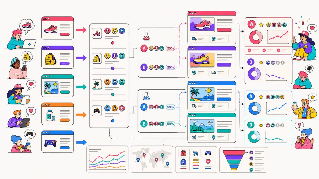
12. Dynamic Content by Traffic Source
A visitor who clicked a Facebook ad about your pricing shouldn’t land on a generic homepage that never mentions pricing. When you match the page’s content to what brought someone there (whether that’s an ad, an email, or a specific search query), it keeps the message consistent all the way through the click.
13. Location or Audience-Based Personalization
Dynamic pages that adjust headline, imagery, or offer based on a visitor’s location, industry, or returning-customer status tend to outperform a single static version shown to everyone. It’s a natural extension of A/B testing ideas once you’ve exhausted the simpler, single-variable tests.
Examples
Airbnb runs thousands of location-personalized landing pages built from one template, and Omnius’s breakdown of the strategy shows each page swaps in location-specific imagery and accommodation details rather than showing every visitor the same generic homepage.
On the paid side, CROLabs’ own ad-to-page personalization approach applies a similar idea to ad traffic: every ad gets its own dedicated landing page instead of routing traffic to one general page, so the page delivers on what the ad promised instead of making the visitor go looking for it.
Where to Go From Here
Thirteen ideas will keep most teams busy well past a single quarter. So pick the category that lines up with where your analytics show the most drop-off first, then run one test at a time so you know what works best. This result tells you what to try next, that’s roughly how experimentation tends to work in practice. Each test feeds the next one, and the gains build on top of each other.
If you’re unsure which of these a/b test ideas to prioritize first, an AI Advisor can crawl your site, flag the friction points costing you conversions, and hand you a prioritized list. This way, you don’t need to guess.
Pair that with a visual editor that lets you build and launch variants without a developer, and the gap between having an idea and having a live test drops from weeks to minutes.
Not Sure What To Test First?
Cancel anytime.
FAQs
How many A/B tests should I run at once?
One test per page, generally. Running two changes on the same page at the same time makes it impossible to know which one caused the lift, or the drop. If you have enough traffic split across different pages, you can run separate tests in parallel without them interfering with each other.
How long should an A/B test run before I call a winner?
Long enough to hit statistical significance and long enough to cover at least one full business cycle, usually a minimum of one to two weeks. Ending a test after three good days because the numbers look promising is how teams end up shipping changes that were actually just a lucky Tuesday.
How much traffic do I need before A/B testing is worth it?
There’s no universal number, since it depends on your current conversion rate and how big a lift you’re hoping to detect. As a rough guide, a page needs a few hundred conversions per variant before the results mean much. Below that, differences you see are often just noise. Our guide on what A/B testing is covers how to think about this before you launch anything.
What’s the difference between A/B testing and multivariate testing?
A/B testing changes one element and compares two versions of a page. Multivariate testing changes several elements at once and measures every possible combination, which tells you more but needs far more traffic to reach a reliable answer. For most sites starting out, A/B testing is the faster path to a real result.
Which A/B test idea should I run first?
Whichever one lines up with your biggest drop-off point. If your analytics show people leaving at the form, start with form-related a/b testing ideas. If your bounce rate is high above the fold, start there instead. Picking based on data beats picking based on what’s easiest to build.
Do I need a developer to run these tests?
Not anymore, for most of what’s on this list. Visual editors let you change headlines, images, button copy, and layout without touching code. Personalization and dynamic content used to be the exception, but tools built for website personalization have closed that gap too. Complex multi-step form logic is one of the few areas where engineering help still speeds things up.
What tools do I need to start testing?
At minimum, an A/B testing platform that can split traffic and track conversions, plus analytics to tell you where visitors are dropping off in the first place. A no-code A/B testing tool like CROLabs covers most of what’s on this list without needing a developer on standby for every variant.