Updated Oct 2026
In 2017, the editors of IEEE Internet Computing went back through two decades of their own issues to find the paper that had aged best. They picked a five-page article from 2003 about how Amazon suggests products to shoppers, and Amazon Science points out that the method inside it had already been running on the store for six years by then.
Twenty-three years later, the ideas in that paper show up as the “you may also like” rows, bundle offers and quizzes on online stores today. The business case has grown along with them. Netflix’s researchers wrote that their recommender system influences about 80% of the hours streamed on the platform, and they estimated that it saves the company more than $1 billion a year through lower cancellations.
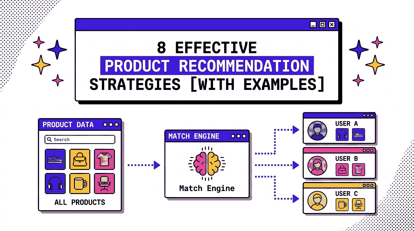
In this article, we’ll go through 8 product recommendation strategies, show where each has worked in the real world, and cover the ways recommendations go wrong. You’ll also see how to test them on your own site with CROLabs, so you can pick the strategies that match the data you have today.
On This Page
What Are Product Recommendation Strategies?
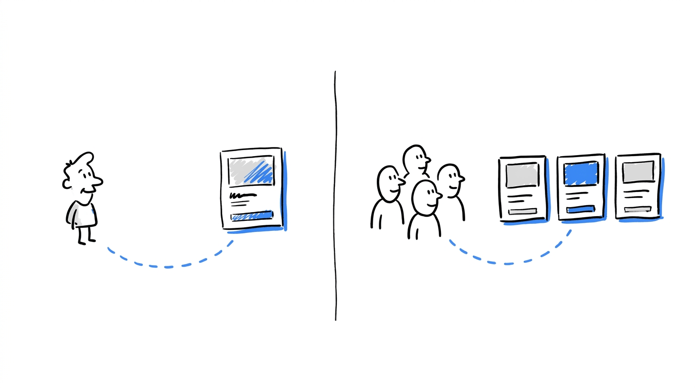
A product recommendation strategy is a defined method for choosing which products to show a visitor and where on the site to show them. The method can draw on what the visitor has already browsed, what other buyers purchased, how they answered a quiz, or what sells best across the store.
Each strategy settles two decisions:
- Who sees the suggestion: One visitor, or a whole segment of visitors.
- Where the suggestion appears: The homepage, a product page, the cart, a confirmation page or an email.
Placement shapes results as much as the algorithm does, so recommendations belong inside the wider work of conversion rate optimization. A strong row of suggestions sitting where visitors rarely scroll gets few clicks, which is why each strategy below comes with a placement.
8 Product Recommendation Strategies That Work [With Examples]
1. Item-to-Item Recommendations
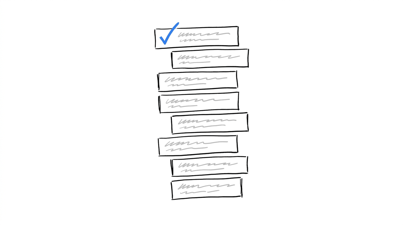
What it is: Products shown on a product page because other buyers purchased them together with the item being viewed (“Customers who bought this also bought”). The logic starts from the product, so a first-time visitor with no history still sees relevant suggestions.
Real-life example: Amazon. The Amazon Science history of its algorithm explains that the team found item-level analysis of purchase histories produced better recommendations than matching a visitor to similar customers. The 2003 paper by Greg Linden, Brent Smith and Jeremy York reports that click-through and conversion rates for these recommendations vastly exceed those of untargeted content such as banner ads and top-seller lists.
How to apply it:
- Put the row on product pages, close to the add-to-cart button, where the visitor is still deciding.
- Build the pairings from purchase data, and use product tags only as a fallback for new items.
- Show same-category best sellers on products that have no order history yet.
2. Frequently Bought Together Bundles
What it is: A small set of complementary products shown with one combined add-to-cart button. The pairing logic resembles item-to-item recommendations, and the single button saves the visitor several clicks.
Real-life example: a thread on the Shopify developer community. One developer described building a “frequently bought together” block with the platform’s productRecommendations query and found that the suggestions looked random at times. The proposed fix was to loop through past orders, identify the products that were bought together and store their IDs in a metafield. Another member pointed to paid tools such as Algolia and added that a custom build was doable.
The order-based approach in that thread is the part worth copying. Bundles built from what customers bought hold up better than a generic related-products feed, and the feed makes a good backup for items with thin history.
How to apply it:
- Export your order history and count how often each pair of products lands in the same order.
- Review the top pairs by hand before they go live, so a pairing that makes no sense never reaches the page.
- Test the block’s position with A/B testing in CROLabs. If the block already exists in your theme, the visual editor lets you move or restyle it without a developer.
3. Quiz-Led Recommendations
What it is: A short set of questions followed by a results page that matches products to the answers. Quizzes work well for catalogs where shoppers struggle to choose, such as skincare, haircare and gifting, and they hand you information the visitor volunteered, including an email address.
Real-life examples:
- JOTT. The French apparel brand had 350+ products and a busy Christmas season, so it added a gift guide quiz built with Quizell. According to the case study, the quiz had a 74% completion rate, a 46% increase in add-to-cart rate and a conversion rate 5x the brand’s daily average.
- Sexy Hair. The haircare brand launched a quiz called “What’s Your Sexy” and redesigned its mobile site in the same project, so the reported results cover both changes: a 37% rise in mobile conversion rate, a 31% rise in average order value and 30% more time on site.
- Florence by Mills. Klaviyo’s quiz guide reports that the beauty brand doubled its on-site conversion rate and collected 23,000 new email addresses through a quiz.
The companies and agencies that built these quizzes published the figures, so your own test will give the number that matters for your store. For a completion benchmark, RevenueHunt says that more than two thirds of shoppers who start one of its quizzes answer every question, and its quizzes run between three and seven questions.
How to apply it:
- Open with an easy question, and keep the full quiz short.
- Show the reason behind each recommended product on the results page.
- Ask for the email address after the results appear, since the visitor has already received something useful.
- Pay attention to consent wording, because quizzes collect personal data. The CROLabs guide to GDPR-compliant marketing tools covers the setup.
- Track quiz starts, completions and purchases with conversion tracking so you can see where visitors leave.
4. Personalized Homepage Rows
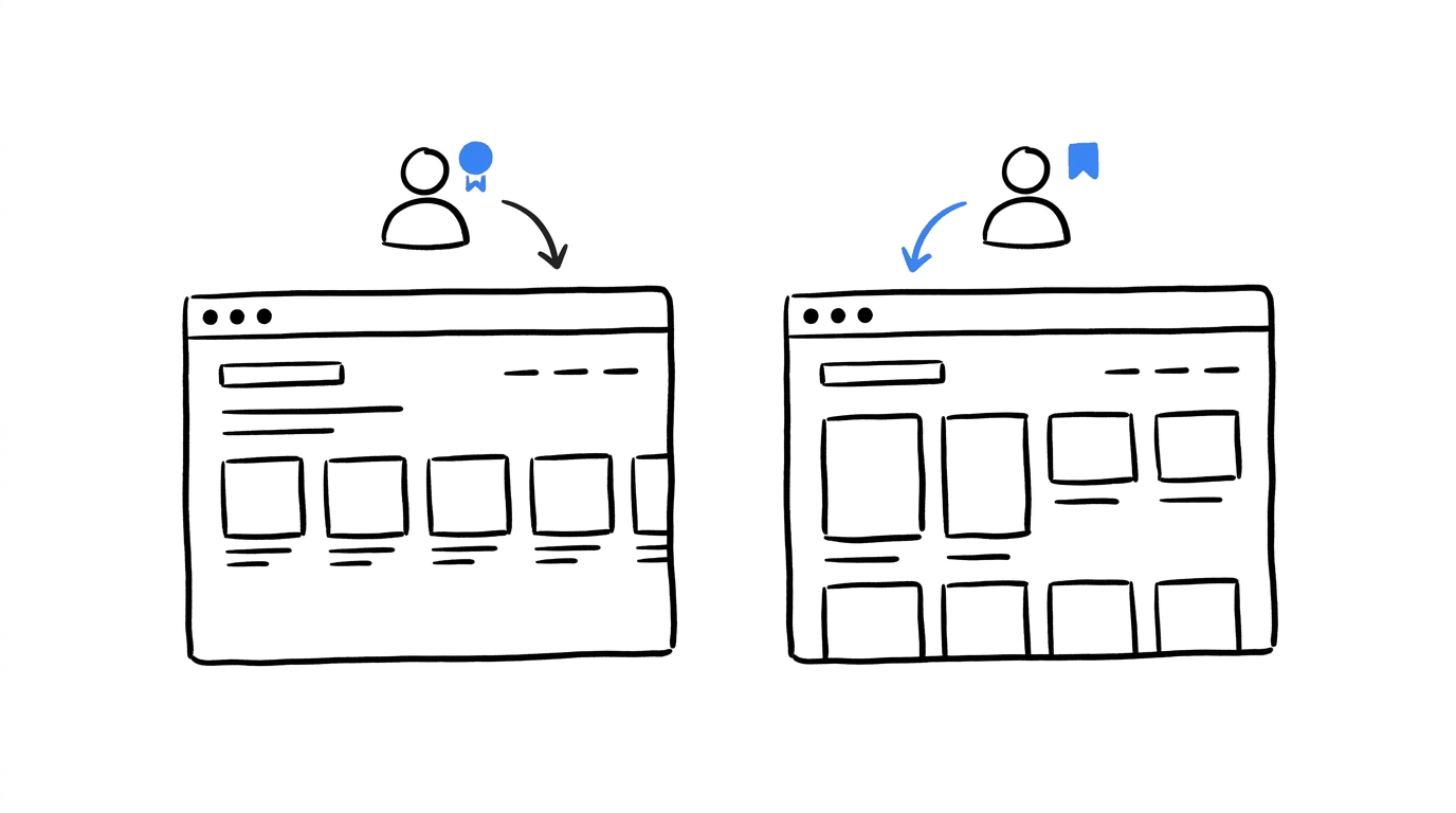
What it is: A homepage that orders its collections and products differently for each visitor, based on browsing and purchase behavior.
Real-life example: Netflix. The Netflix paper describes a family of algorithms, most of which come together on the homepage, with rows such as Top Picks and Continue Watching. Position inside a row carries weight too. Carlos Gomez-Uribe told Wired that titles sitting nearer the start of a row get played more often, a point RTInsights covers in its summary of the paper.
A store can borrow that structure at a smaller scale. Reorder the collection tiles by what a returning visitor browsed last, and place the best-matching products in the first positions of each row.
How to apply it:
- Start with two or three audience segments, such as returning buyers and first-time visitors.
- Change the featured collection and hero product for each segment, then compare against the default page.
- Use CROLabs to personalize pages by audience, and keep the original page as the control in an A/B test.
Know what to fix before changing your recommendations
A recommendation block may be underperforming because of its placement, page layout or the experience around it. CROLabs’ AI Advisor audits your website, flags conversion issues and helps you identify what to investigate first.
5. Popularity Blended With Personalization
What it is: A best-sellers or trending row that fills the page for visitors with no history, and mixes with personal signals as behavior data builds up.
Real-life example: Netflix again. The same RTInsights summary notes that the paper found personalized ranking works better when it is mixed with unpersonalized popularity, and Netflix runs a Trending Now row for that purpose. Amazon’s paper adds a useful comparison, because it reports that targeted suggestions beat top-seller lists on click-through and conversion. A popularity row therefore earns its place for first-time visitors and gives way to personal picks as the data grows.
How to apply it:
- Show best sellers from the last 30 days to visitors with no browsing history.
- Switch to personal picks once the visitor has viewed a few products.
- For paid traffic, match the landing page to the ad so that the first products on screen are the ones the ad promised.
6. Recently Viewed and Behavior-Triggered Suggestions
What it is: A row of items the visitor already looked at, often paired with similar products. The same logic powers browse-abandonment emails.
This strategy has the shortest setup of the eight, since the data comes from the visitor’s own session. The two details that matter are the position of the row and the order of its contents.
How to apply it:
- Show the row on the homepage for returning visitors and on category pages, where comparison happens.
- Remove products the visitor has already bought.
- Put the most recently viewed item first, followed by close alternatives.
- Check with analytics and heatmaps whether visitors scroll far enough to see the row, and move it up if they do not.
7. Cart and Post-Purchase Recommendations
What it is: Add-on suggestions shown in the cart, plus follow-up products on the confirmation page and in the order email.
The cart is the page where visitors decide whether to buy, and a suggestion there adds one more decision. For that reason, it helps to read about how to reduce cart abandonment before you add anything to the page. Low-priced add-ons that match the items in the cart suit this spot. After purchase, the visitor has already committed, so accessories and refills fit better than a second large item.
How to apply it:
- Limit the cart to one short row of add-ons that cost less than the main item.
- Use the confirmation page for accessories and replenishment items.
- If you attach a discount to an add-on, the guide on whether to A/B test your pricing explains how to measure it safely.
8. Test and Iterate on Every Placement
What it is: A habit of treating each recommendation block as a hypothesis, so that placement, item count and heading text all get compared against alternatives.
Real-life example: Netflix once more. The Netflix paper lists A/B testing among its core subjects next to the algorithms, which shows how central testing is to the system. The recommendation logic gets tested alongside the design around it.
What to test first:
- Position of the block on the page.
- Number of products shown, for example four against six.
- Heading text, such as “Customers also bought” against “Complete your order”.
- The data source behind the suggestions, such as purchase history against manual picks.
Results compound, so the winner of one test becomes the control of the next. The CRO roadmap guide covers the sequencing. When two elements interact, such as the heading and the item count, multivariate testing compares the combinations in one experiment.
Where Recommendations Break: Four Failure Patterns
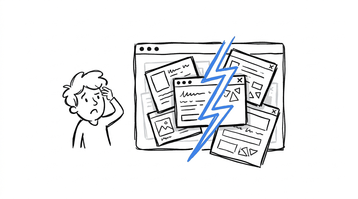
Strategy choice gets most of the attention, yet the failures below are what show up once a block goes live.
- Suggestions that look random. The Shopify thread above is a live example. When a block ignores real purchase data, visitors see unrelated products and stop looking at the row.
- No data for new visitors and new products. A visitor on a first session and a product launched yesterday have no history, so the algorithm has nothing to match. A best-sellers fallback covers the gap.
- Crowded pages. Several recommendation widgets on one page compete for the same attention. Add one block at a time and compare results before adding the next.
- Personal data without a legal basis. Quizzes and personalization collect information about identifiable people. The GDPR guide from Complaion lists the legal bases available, and it covers the data minimization principle, which says to collect only what the stated purpose needs.
Find the best spot for your product bundles
Moving a bundle higher on the product page could make it easier to notice, but you’ll want to test that against your current layout. Use CROLabs to adjust the block with the visual editor and A/B test its position against the original page.
Which Strategy To Start With
The right first move depends on the data and traffic you already have. This table matches common situations to a strategy, a placement and a CROLabs feature for testing it.
| Your situation | Start with | Where it goes | Test it with |
|---|---|---|---|
| Solid order history, lots of product page traffic | Item-to-item or bundles (1 and 2) | Product page | A/B Testing |
| Large catalog, visitors unsure what to pick | Quiz-led recommendations (3) | Homepage or collection page | Visual Editor and Conversion Tracking |
| Many first-time visitors from paid ads | Popularity row (5) | Landing page | Ad-to-Page Personalization |
| Returning visitors with browsing history | Personalized rows and recently viewed (4 and 6) | Homepage and category pages | Audience Personalization |
| Visitors leaving at the cart | Cart add-ons (7) | Cart | Analytics & Heatmaps |
How To Test Recommendations With CROLabs
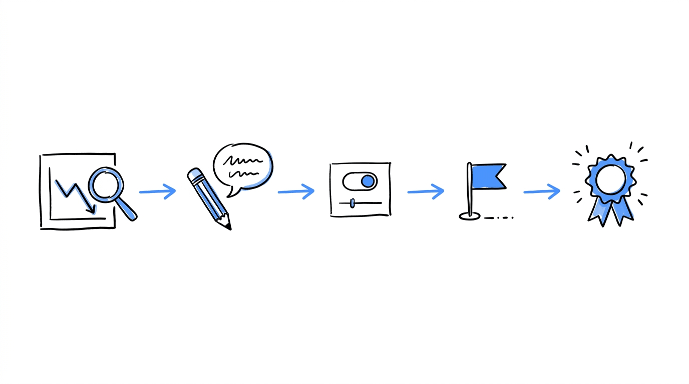
Recommendation engines and quiz apps decide what to show. CROLabs helps you decide where it sits, who sees it and whether it lifts conversions. The process takes five steps:
- Find the weak page. Open analytics and heatmaps to see where visitors drop off, and run the AI Advisor, which crawls your site and checks which issues cost you conversions against industry benchmarks.
- Write one hypothesis per placement. For example: “Moving the bundle block above the reviews will raise add-to-cart rate on product pages”.
- Build the variant. Use the visual editor to move or restyle the block without code, then launch an A/B test so traffic splits between the original and the variant.
- Track the right events. Set up add-to-cart, purchase and order value events with conversion tracking. The guide on which website actions to track helps you choose.
- Keep the winner and test the next element. Pick run dates with the experiment scheduling guide so that sales events and holidays do not distort the result.
CROLabs offers a 14-day free trial, which gives you enough time to launch the first test on one product page.
Conclusion
Product recommendation strategies range from a one-click bundle on a product page to a full quiz on the homepage.
Choose one strategy that fits your current data, place it where visitors are deciding, and test it against the page you have now. Each winning test becomes the baseline for the next one, and CROLabs gives you the A/B testing, analytics and personalization tools to run that loop in one platform.
Ready to test your product recommendations?
FAQs