Low-quality traffic, off timing, or the economy are some of the usual suspects that get blamed anytime a visitor lands on your website without converting.
Maybe some of that is true, but the real culprit, more often than anyone would like to admit, is that something in the experience broke down.
The frustrating part is that you can’t see exactly where it breaks. You just see the output i.e low conversion rates, high bounce rates, a funnel that leaks, etc.
With a UX audit, however, you get to see where both the output and exactly where that breakdown happened.
On This Page
What Is A UX Audit?
A UX audit is a structured evaluation of your website’s user experience. The goal is to find what’s confusing, what’s creating friction, and what’s sending people away before they ever reach your conversion point.
Think of it as a cousin of the CRO audit. A CRO audit looks at the messaging, traffic quality, landing pages, experimentation results, etc aka the full conversion funnel.
A UX audit goes deeper into the actual interface. It’s asking questions like is this navigation confusing to a first-time visitor?, is this form killing momentum right when someone is ready to commit?, and does this page even communicate what a new user needs to know to feel confident moving forward?.
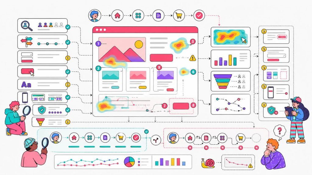
It’s all about behaviour (how users actually move through your site) and where that diverges from how you expected them to move through it.
A standard UX audit covers:
- Navigation flow and information architecture
- Page load speed and performance
- CTA placement, clarity, and visibility
- Form design and input friction
- Readability and visual hierarchy
- Mobile experience
- Trust signals and credibility elements
- Drop-off points across the conversion funnel
Benefits of Conducting A UX Audit
The most practical benefit is that you stop guessing.
Without a UX audit, most conversion optimization decisions come from instinct. For example, someone on the team says the CTA button should be green and nobody has the data to push back.
It may work occasionally, but it doesn’t scale. And it absolutely won’t consistently improve website conversion rate.
Here’s what a well-executed UX audit actually gives you.
a. You find exactly where your funnel leaks
Lucky for you, your funnel loses people at specific, identifiable points instead of randomly. So with a UX audit, you can find out where exactly that is and fix the things that are actually bleeding conversions.

b. Your experimentation programme gets a direction
A/B testing without hypotheses rooted in real behaviour is too expensive a guess. You’re spending traffic and time on tests that may not move the needle. But when you do run experiments after conducting a UX audit, they’re grounded in something real.
c. It’s cheaper than a full redesign
A lot of companies run full redesigns when conversion rates tank. Some of those redesigns make things worse because they’ve replaced a broken thing with a different broken thing. A UX audit tells you which parts of the experience are broken and which are working, so you’re not tearing down something that was fine.
d. It builds the business case for change
A UX audit gives you documented findings with supporting data. That data helps get things approved and prioritised, because if you need engineering time, design resources, or a budget to fix UX issues, then you need evidence to power them.
d. It improves conversion without requiring more traffic
Fixing the experience of your website visitors is almost always the better (and cheaper) solution to improving your conversion rate, lowering cart abandonment rate, reducing bounce rate and more.
It’s unfortunate that it’s not widely known because the default for most businesses when revenue stalls is “let’s buy more traffic”, but if your conversion rate is 1% and your competitor’s is 3%, tripling your ad spend doesn’t solve the problem.
How To Perform A UX Audit
A proper UX audit has distinct phases. Let’s get into the actual process.
1. Define What You’re Auditing And Why
Like with most things before you start them, you should set a clear goal.
A full-site UX audit looks completely different (both in process and result) from a focused UX audit on a single user journey. It’s always best to know what you’re trying to find before you start looking.
You may be seeing low conversions on a specific landing page, or an abnormally high bounce rate only on mobile, or a lot of dropping off happening on the checkout page, or you might even be about to launch a major experimentation programme and want to know where to focus. All these are signals that help shape and influence what your goal will be.
You should also define what counts as a conversion for this audit. It can be a sign-up, a purchase, or a demo booked. You can’t identify experience problems if you haven’t defined what the experience is supposed to drive people toward.
2. Collect Quantitative Data
This is quite literally where the numbers come in.
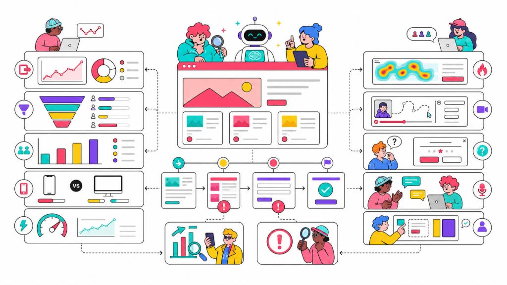
The purpose of this phase is understanding what is happening before you try to explain why. You do this by pulling data from your analytics stack (Google Analytics 4 is the obvious starting point) and looking for:
- Pages with high exit rates (where are people leaving?)
- Funnel drop-off points (where in the flow are you losing them?)
- Conversion rate by traffic source (which channels bring people who actually convert?)
- Mobile vs. desktop conversion gap (if it’s wide, that’s a UX problem, not a traffic problem)
- Page load speed by page and device
If your mobile conversion rate is half your desktop rate, or if 40% of your traffic hits your pricing page and 80% of them leave without clicking anything, those are patterns, and that’s what you’re looking for.
3. Collect Qualitative Data
The numbers (step 2) tell you where people drop off while the qualitative data (this step) tells you why. You need both because without qualitative insight, you’re still guessing at the cause.
- Heatmaps and session recordings
Tools like CROLabs, Microsoft Clarity, and Hotjar let you watch how real users interact with your pages. You can see where they click, where they stopped scrolling, what they’re completely ignoring that you thought was prominent, and more. Session recordings are important to watch because sometimes people use websites in ways you’d never anticipate.
- Exit-intent surveys
A single pop-up asking “What stopped you from signing up today?” right as someone is about to leave can reveal objections you had no idea were happening. To make the best use of this, keep it short (aim for one question).
- User interviews
If you have access to real users (customers, trial users, churned accounts), talk to them. Ask them to walk you through how they use the site and listen to how they describe what they’re looking for. Also watch where they hesitate and ask churned users for feedback on what pushed them to leave.
- Usability tests
Give people a task (e.g try to start a free trial) and watch them attempt it without guidance. Three to five recorded sessions with people who match your target user will reveal useful patterns.
Your funnel isn’t leaking randomly.
See exactly where users get confused, hesitate, or abandon the journey.
4. Run A Heuristic Evaluation
A heuristic evaluation is a structured walkthrough of your site against a set of established usability principles. The most widely used framework is Jakob Nielsen’s 10 usability heuristics. It consists of things like visibility of system status, user control and freedom, consistency, and error prevention.
To run a heuristic evaluation, walk through your site as a first-time visitor. This is important because you need to discard assumptions about what people already know and avoid using shortcuts that only you as the website owner know. Ask:
- Is it immediately obvious what this site is for and who it’s built for?
- Can someone navigate without reading the documentation?
- Are error messages clear (do they actually tell you what to do next?)
- Is there a clear visual hierarchy on each page? Do you know where to look first?
- Does the copy communicate what the user gains, or just describe what the product does?
- Are CTAs visible, specific, and clear about what happens when you click them?
Document every issue you find with a severity rating (high, medium, or low). Not everything will be equally worth fixing so the ratings are what help you prioritise later.
5. Audit For Accessibility And Performance
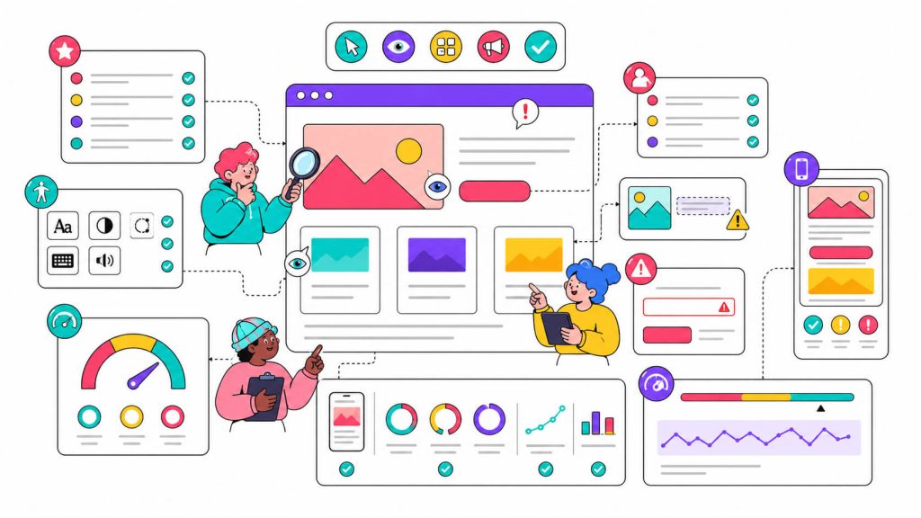
Accessibility affects more users than most people assume. Around 15% of the global population lives with some form of disability.
Poor colour contrast, missing alt text, or navigation that breaks with keyboard-only excludes people and it’s a legal risk in many markets. You can use tools like WAVE, Axe, or Google Lighthouse to run an automated accessibility check.
Performance is a conversion issue. Google’s research found that as page load time increases from 1 second to 3 seconds, bounce probability goes up by 32%.
So to make sure your page’s performance isn’t substandard, run your key pages through Google PageSpeed Insights or GTmetrix. Also look at your Core Web Vitals, specifically Largest Contentful Paint (LCP), First Input Delay (FID), and Cumulative Layout Shift (CLS). These directly affect both experience and organic search rankings, which makes them worth fixing twice over.
6. Benchmark Against Competitors And Industry Averages
Your conversion metrics don’t exist in a vacuum, you need context.
A 2% conversion rate sounds bad until you realise it’s the industry average for your product category or sounds fine until you discover your top competitor is at 5%.
So look at industry benchmarks for your category. Then study your competitors (don’t copy them!) to understand how they’ve approached the same UX problems you’re facing. Pay attention to how they structure navigation, what their above-the-fold section communicates, where they place trust signals, and how they handle their primary CTA.
7. Synthesise Findings And Prioritise
By this point you have a lot in the way of quantitative patterns, qualitative insights, heuristic notes, performance scores, and benchmark context.
The job now is synthesis.
You start by grouping findings into themes. Make the themes actionable, something like “users consistently miss the primary CTA across three high-traffic pages due to low contrast and placement below a dense copy block”.
Then, prioritise using impact vs. effort. You’re trying to get the best possible return on the first round of changes, so high impact, low effort fixes go first and complex issues that require a full page redesign go on a longer roadmap.
Every prioritised finding should come with a hypothesis that you take into the next phase.
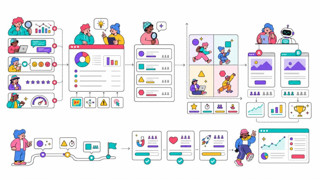
8. Run Experiments To Validate Your Findings
Now that you have your hypothesis, the UX audit can connect directly to conversion rate optimization.
You start by testing the hypothesis. A/B testing is the most common format for this. You create a control (the current experience) and a variant (your proposed fix), split traffic manually (or let a tool like CROLabs do it automatically), then measure impact against your conversion goals.
If the variant wins with statistical significance, ship it. If it doesn’t, you’ve still learned something, which is more than you’d get from rolling something out site-wide and wondering why the numbers moved.
Pro Tip: Your users change, your product changes, and your market changes so your UX audit should not be a one-time event. The companies with consistently high conversion rates treat experimentation as an ongoing practice.
Turn UX Findings Into Experiments
A UX audit is only valuable if you act on it. Build, launch, and measure A/B tests without developers and validate every improvement with real data.
How CROLabs Can Help You Conduct A UX Audit
Even though running a UX audit generates a lot of data, knowing what to do with it is the hard part.
Usually, you’ll need five different tools to get a complete picture but thankfully, CROLabs brings analytics, heatmaps, and A/B testing into one platform.
Here’s how it fits into the audit process:
a. Analytics and funnel tracking
Set up conversion goals and funnel tracking in CROLabs to see exactly where users drop off. You get a focused view of your key user journeys without manually pulling data across a dozen reports.
b. AI Advisor
The AI Advisor crawls your site, analyses your pages against conversion benchmarks, and flags friction points (ranked by what’s most likely costing you conversions). Instead of getting a raw data export to interpret yourself, you get a ranked list of what to fix first.
c. A/B testing and experimentation
Once your audit surfaces hypotheses, you build and launch experiments directly in CROLabs, no developer required. The Visual Editor handles changes to page elements, the platform manages traffic splitting, and you get clean statistical results without needing a data analyst to read them.
d. Session recordings and heatmaps
See where users click, how far they scroll, and what they’re ignoring. These features are the qualitative layers that make your quantitative findings make sense.
Get UX Insights Without Juggling Five Tools
Analytics, heatmaps, session recordings, AI recommendations, and A/B testing all in one place. Everything you need to run a complete UX audit.
Conclusion
A UX audit is the difference between improving conversion rate systematically and guessing your way through optimisation until something sticks.
If it’s done properly, it tells you what’s broken, gives you the evidence to justify every change you make, and builds the foundation for a continuous experimentation programme.
You don’t need a six-figure budget or a UX agency on retainer to do this. You need a structured process, the right data, and a tool that helps you act on what you find.
If you want a tool that handles the analytics, AI recommendations, and A/B testing in one place, CROLabs has a 14-day free trial, no credit card required.
Better UX means better conversions
Identify usability issues, prioritize fixes, and turn insights into measurable growth.
FAQ
What’s the difference between a UX audit and a CRO audit?
A CRO audit is broader. It typically covers the full conversion funnel (traffic quality, messaging strategy, landing page structure, and experimentation results). A UX audit is more focused on the interface itself (navigation, visual hierarchy, form design, CTA clarity, and where the experience creates friction). In practice the two overlap heavily. A thorough CRO audit will include UX analysis, and a UX audit should always connect its findings to conversion impact.
How long does a UX audit take?
The duration is scope-dependent. A focused audit on a single landing page or checkout flow can be completed in a few days while a full-site UX audit, including user research and a proper synthesis phase, typically takes two to four weeks. Where most teams underinvest is the synthesis phase, the part where you go from “a list of problems” to “a prioritised plan with hypotheses”. That phase is where most of the value is.
How often should you run a UX audit?
At minimum, once a year or whenever you’re planning a significant redesign, launching a major feature, entering a new market, or seeing an unexpected drop in conversion metrics. Ideally, you’re running continuous micro-audits through your experimentation programme rather than relying on infrequent large-scale ones.
Do I need a UX designer to run a UX audit?
No, but it helps. The heuristic evaluation phase benefits from someone with a design eye. But most of the process (analytics, heatmap analysis, usability testing, synthesising findings) can be done effectively by marketers, product managers, or growth teams.
What does a UX audit almost always find?
Poor CTA clarity and placement. It’s not the most exciting answer, but it shows up in almost every audit. Most sites have CTAs that are buried, vague, or visually weak.
Will a UX audit definitely improve my conversion rate?
A UX audit identifies problems. Fixing those problems and validating the fixes through experimentation is what improves conversion rate.
Is a UX audit worth it for a small website or early-stage product?
Yes, with caveats. If you’re getting less than a few hundred visitors a month, you won’t have enough data to make most quantitative findings statistically meaningful. In that case, lean harder on usability testing and qualitative methods, and hold off on A/B testing until you have enough traffic for tests to reach significance. The heuristic evaluation in particular is valuable at any stage, and it costs nothing except time and requires no traffic.